Chapter 6.2.1 Simple Linear Regression
Linear regression is a very powerful statistical technique. Many people have some familiarity with regression just from reading the news, where graphs with straight lines are overlaid on scatterplots. Linear models can be used for prediction or to evaluate whether there is a linear relationship between two numerical variables.
Figure 5.1 shows two variables whose relationship can be modeled perfectly with a straight line. The equation for the line is
y = 5 + 57.49x
Imagine what a perfect linear relationship would mean: you would know the exact value of y just by knowing the value of x. This is unrealistic in almost any natural process. For example, if we took family income x, this value would provide some useful information about how much financial support y a college may offer a prospective student. However, there would still be variability in financial support, even when comparing students whose families have similar financial backgrounds.
Linear regression assumes that the relationship between two variables, x and y, can be modeled by a straight line:
y = β0 + β1x
where β0 and β1 represent two model parameters. These parameters are estimated using data, and we write their point estimates as b0 and b1.
When we use x to predict y, we usually call x the explanatory or predictor variable, and we call y the response.
Now that we are equipped with data visualization skills from Chapter 3, an understanding of the “tidy” data format from Chapter 4, and data wrangling skills from Chapter 5, we now proceed with data modeling. The fundamental premise of data modeling is to make explicit the relationship between:
- an outcome variable , also called a dependent variable and
- an explanatory/predictor variable , also called an independent variable or covariate.
Another way to state this is using mathematical terminology: we will model the outcome variable as a function of the explanatory/predictor variable . Why do we have two different labels, explanatory and predictor, for the variable ? That’s because roughly speaking data modeling can be used for two purposes:
- Modeling for prediction: You want to predict an outcome variable based on the information contained in a set of predictor variables. You don’t care so much about understanding how all the variables relate and interact, but so long as you can make good predictions about , you’re fine. For example, if we know many individuals’ risk factors for lung cancer, such as smoking habits and age, can we predict whether or not they will develop lung cancer? Here we wouldn’t care so much about distinguishing the degree to which the different risk factors contribute to lung cancer, but instead only on whether or not they could be put together to make reliable predictions.
2. Modeling for explanation: You want to explicitly describe the relationship between an outcome variable and a set of explanatory variables, determine the significance of any found relationships, and have measures summarizing these. Continuing our example from above, we would now be interested in describing the individual effects of the different risk factors and quantifying the magnitude of these effects. One reason could be to design an intervention to reduce lung cancer cases in a population, such as targeting smokers of a specific age group with an advertisement for smoking cessation programs. In this book, we’ll focus more on this latter purpose.
Data modeling is used in a wide variety of fields, including statistical inference, causal inference, artificial intelligence, and machine learning.
There are many techniques for data modeling, such as tree-based models, neural networks and deep learning, and supervised learning. In this chapter, we’ll focus on one particular technique: linear regression, one of the most commonly-used and easy-to-understand approaches to modeling. Recall our discussion in Subsection 2.4.3 on numerical and categorical variables. Linear regression involves:
- an outcome variable that is numericaland
- explanatory variables that are either numerical or categorical.
With linear regression there is always only one numerical outcome variable but we have choices on both the number and the type of explanatory variables to use. We’re going to cover the following regression scenarios:
- In this current chapter on basic regression, we’ll always have only one explanatory variable.
- In the next chapter, Chapter 7 on multiple regression, we’ll have more than one explanatory variable:
- We’ll focus on two numerical explanatory variables and in Section 7.1. This can be denoted as as well since we have more than one explanatory variable.
-
- We’ll use one numerical and one categorical explanatory variable in Section 7.1. We’ll also introduce interaction models here; there, the effect of one explanatory variable depends on the value of another.
We’ll study all four of these regression scenarios using real data, all easily accessible via R packages!
Needed packages
In this chapter we introduce a new package, moderndive, that is an accompaniment package to this ModernDive book. It includes useful functions for linear regression and other functions as well as data used later in the book. Let’s now load all the packages needed for this chapter. If needed, read Section 2.3 for information on how to install and load R packages.
library(ggplot2)
library(dplyr)
library(moderndive)
library(gapminder)
library(skimr)
Conclusion
In this chapter, you’ve seen what we call “basic regression” when you only have one explanatory variable. In Chapter 7, we’ll study multiple regression where we have more than one explanatory variable! In particular, we’ll see why we’ve been conducting the residual analyses from Subsections 6.1.4 and 6.2.4. We are actually verifying some very important assumptions that must be met for the std_error (standard error), p_value, lower_ci and upper_ci (the end-points of the confidence intervals) columns in our regression tables to have valid interpretation. Again, don’t worry for now if you don’t understand what these terms mean. After the next chapter on multiple regression, we’ll dive in!
Linear models can be used to approximate the relationship between two variables. However, these models have real limitations. Linear regression is simply a modeling framework. The truth is almost always much more complex than our simple line. For example, we do not know how the data outside of our limited window will behave.
Applying a model estimate to values outside of the realm of the original data is called extrapolation.
Generally, a linear model is only an approximation of the real relationship between two variables. If we extrapolate, we are making an unreliable bet that the approximate linear relationship will be valid in places where it has not been explored.
One categorical explanatory variable
It’s an unfortunate truth that life expectancy is not the same across various countries in the world; there are a multitude of factors that are associated with how long people live. International development agencies are very interested in studying these differences in the hope of understanding where governments should allocate resources to address this problem. In this section, we’ll explore differences in life expectancy in two ways:
- Differences between continents: Are there significant differences in life expectancy, on average, between the five continents of the world: Africa, the Americas, Asia, Europe, and Oceania?
- Differences within continents: How does life expectancy vary within the world’s five continents? For example, is the spread of life expectancy among the countries of Africa larger than the spread of life expectancy among the countries of Asia?
To answer such questions, we’ll study the gapminder dataset in the gapminder package. Recall we mentioned this dataset in Subsection 3.1.2 when we first studied the “Grammar of Graphics” introduced in Figure 3.1. This dataset has international development statistics such as life expectancy, GDP per capita, and population by country (= 142) for 5-year intervals between 1952 and 2007.
We’ll use this data for linear regression again, but note that our explanatory variable is now categorical, and not numerical like when we covered simple linear regression in Section 6.1. More precisely, we have:
- A numerical outcome variable . In this case, life expectancy.
- A single categorical explanatory variable , In this case, the continent the country is part of.
When the explanatory variable is categorical, the concept of a “best-fitting” line is a little different than the one we saw previously in Section 6.1 where the explanatory variable was numerical. We’ll study these differences shortly in Subsection 6.2.2, but first we conduct our exploratory data analysis.
EDA
gapminder2007 %>%
  select(continent, lifeExp) %>%
  skim()
Skim summary statistics
n obs: 142
n variables: 2
── Variable type:factor ───────────────────────────────────────────────────────────────
variable missing complete n n_unique top_counts
continent 0 142 142 5 Afr: 52, Asi: 33, Eur: 30, Ame: 25
ordered
FALSE
── Variable type:numeric ──────────────────────────────────────────────────────────────
variable missing complete n mean sd p0 p25 p50 p75 p100
lifeExp 0 142 142 67.01 12.07 39.61 57.16 71.94 76.41 82.6
hist
▂▂▂▂▂▃▇▇The output now reports summaries for categorical variables (the variable type: factor) separately from the numerical variables. For the categorical variable continent it now reports:
missing,complete,nas before which are the number of missing, complete, and total number of values.n_unique: The unique number of levels to this variable, corresponding to Africa, Asia, Americas, Europe, and Oceaniatop_counts: In this case the top four counts: Africa has 52 entries each corresponding to a country, Asia has 33, Europe has 30, and Americans has 25. Not displayed is Oceania with 2 countriesordered: Reporting whether the variable is “ordinal.” In this case, it is not ordered.
Given that the global median life expectancy is 71.94, half of the world’s countries (71 countries) will have a life expectancy less than 71.94. Further, half will have a life expectancy greater than this value. The mean life expectancy of 67.01 is lower however. Why are these two values different? Let’s look at a histogram of lifeExp in Figure 6.13 to see why.
We see that this data is left-skewed/negatively skewed: there are a few countries with very low life expectancies that are bringing down the mean life expectancy. However, the median is less sensitive to the effects of such outliers. Hence the median is greater than the mean in this case.
Let’s create a corresponding visualization. One way to compare the life expectancies of countries in different continents would be via a faceted histogram. Recall we saw back in the Data Visualization chapter, specifically Section 3.6, that facets allow us to split a visualization by the different levels of a categorical variable or factor variable. In Figure 6.14, the variable we facet by is continent, which is categorical with five levels, each corresponding to the five continents of the world.
Some people prefer comparing a numerical variable between different levels of a categorical variable, in this case comparing life expectancy between different continents, using a boxplot over a faceted histogram as we can make quick comparisons with single horizontal lines. For example, we can see that even the country with the highest life expectancy in Africa is still lower than all countries in Oceania.
It’s important to remember however that the solid lines in the middle of the boxes correspond to the medians (i.e. the middle value) rather than the mean (the average). So, for example, if you look at Asia, the solid line denotes the median life expectancy of around 72 years, indicating to us that half of all countries in Asia have a life expectancy below 72 years whereas half of all countries in Asia have a life expectancy above 72 years. Furthermore, note that:
-
Africa and Asia have much more spread/variation in life expectancy as indicated by the interquartile range (the height of the boxes).
-
Oceania has almost no spread/variation, but this might in large part be due to the fact there are only two countries in Oceania: Australia and New Zealand.
Now, let’s start making comparisons of life expectancy between continents. Let’s use Africa as a baseline for comparison. Why Africa? Only because it happened to be first alphabetically, we could have just as appropriately used the Americas as the baseline for comparison. Using the “eyeball test” (just using our eyes to see if anything stands out), we make the following observations about differences in median life expectancy compared to the baseline of Africa:
- The median life expectancy of the Americas is roughly 20 years greater.
- The median life expectancy of Asia is roughly 20 years greater.
- The median life expectancy of Europe is roughly 25 years greater.
- The median life expectancy of Oceania is roughly 27.8 years greater.
Let’s remember these four differences vs Africa corresponding to the Americas, Asia, Europe, and Oceania: 20, 20, 25, 27.8.
Linear regression
In Subsection 6.1.2 we introduced simple linear regression, which involves modeling the relationship between a numerical outcome variable as a function of a numerical explanatory variable , in our life expectancy example, we now have a categorical explanatory variable continent. While we still can fit a regression model, given our categorical explanatory variable we no longer have a concept of a “best-fitting” line, but rather “differences relative to a baseline for comparison.”
Before we fit our regression model, let’s create a table similar to Table 6.6, but
- Report the mean life expectancy for each continent.
- Report the difference in mean life expectancy relative to Africa’s mean life expectancy of 54.806 in the column “mean vs Africa”; this column is simply the “mean” column minus 54.806.
Think back to your observations from the eyeball test of Figure 6.15 at the end of the last subsection. The column “mean vs Africa” is the same idea of comparing a summary statistic to a baseline for comparison, in this case the countries of Africa, but using means instead of medians.
| continent | mean | mean vs Africa |
|---|---|---|
| Africa | 54.8 | 0.0 |
| Americas | 73.6 | 18.8 |
| Asia | 70.7 | 15.9 |
| Europe | 77.6 | 22.8 |
| Oceania | 80.7 | 25.9 |
Now, let’s use the get_regression_table() function we introduced in Section 6.1.2 to get the regression table for gapminder2007 analysis:
lifeExp_model <- lm(lifeExp ~ continent, data = gapminder2007)
get_regression_table(lifeExp_model)| term | estimate | std_error | statistic | p_value | lower_ci | upper_ci |
|---|---|---|---|---|---|---|
| intercept | 54.8 | 1.02 | 53.45 | 0 | 52.8 | 56.8 |
| continentAmericas | 18.8 | 1.80 | 10.45 | 0 | 15.2 | 22.4 |
| continentAsia | 15.9 | 1.65 | 9.68 | 0 | 12.7 | 19.2 |
| continentEurope | 22.8 | 1.70 | 13.47 | 0 | 19.5 | 26.2 |
| continentOceania | 25.9 | 5.33 | 4.86 | 0 | 15.4 | 36.5 |
Just as before, we have the term and estimates columns of interest, but unlike before, we now have 5 rows corresponding to 5 outputs in our table: an intercept like before, but also continentAmericas, continentAsia, continentEurope, and continentOceania. What are these values? First, we must describe the equation for fitted value , which is a little more complicated when the explanatory variable is categorical:
Let’s break this down. First, is what’s known in mathematics as an “indicator function” that takes one of two possible values:
In a statistical modeling context this is also known as a “dummy variable”. In our case, let’s consider the first such indicator variable:
Now let’s interpret the terms in the estimate column of the regression table. First intercept = 54.8 corresponds to the mean life expectancy for countries in Africa, since for country in Africa we have the following equation:
i.e. All four of the indicator variables are equal to 0. Recall we stated earlier that we would treat Africa as the baseline for comparison group. Furthermore, this value corresponds to the group mean life expectancy for all African countries in Table 6.7.
Next, = continentAmericas = 18.8 is the difference in mean life expectancies of countries in the Americas relative to Africa, or in other words, on average countries in the Americas had life expectancy 18.8 years greater. The fitted value yielded by this equation is:
i.e. in this case, only the indicator function is equal to 1, but all others are 0. Recall that 72.9 corresponds to the group mean life expectancy for all countries in the Americas in Table 6.7.
Similarly, = continentAsia = 15.9 is the difference in mean life expectancies of Asian countries relative to Africa countries, or in other words, on average countries in the Asia had life expectancy 18.8 years greater than Africa. The fitted value yielded by this equation is:
i.e. in this case, only the indicator function is equal to 1, but all others are 0. Recall that 70.7 corresponds to the group mean life expectancy for all countries in Asia in Table 6.7. The same logic applies to and ; they correspond to the “offset” in mean life expectancy for countries in Europe and Oceania, relative to the mean life expectancy of the baseline group for comparison of African countries.
Let’s generalize this idea a bit. If we fit a linear regression model using a categorical explanatory variable that has levels, a regression model will return an intercept and “slope” coefficients.
When is a numerical explanatory variable the interpretation is of a “slope” coefficient, but when is categorical the meaning is a little trickier. They are offsets relative to the baseline.
In our case, since there are continents, the regression model returns an intercept corresponding to the baseline for comparison Africa and slope coefficients corresponding to the Americas, Asia, Europe, and Oceania. Africa was chosen as the baseline by R for no other reason than it is first alphabetically of the 5 continents. You can manually specify which continent to use as baseline instead of the default choice of whichever comes first alphabetically, but we leave that to a more advanced course. (The forcats package is particularly nice for doing this and we encourage you to explore using it.)
Example: Categorical predictors with two levels
Categorical variables are also useful in predicting outcomes. Here we consider a categorical predictor with two levels (recall that a level
is the same as a category). We’ll consider Ebay auctions for a video game,
Mario Kart for the Nintendo Wii, where both the total price of the auction and the condition of the game were recorded.
Here we want to predict total price based on game condition, which takes values used and new. A plot of the auction data is shown in Figure 5.16.
To incorporate the game condition variable into a regression equation, we must convert the categories into a numerical form. We will do so using an indicator variable called cond_new , which takes value 1 when the game is new and 0 when the game is used. Using this indicator variable, the linear model may be written as
We’ll elaborate further on this auction data in Chapter 6, where we examine the influence of many predictor variables simultaneously using multiple regression. In multiple regression, we will consider the association of auction price with regard to each variable while controlling for the influence of other variables. This is especially important since
some of the predictors are associated. For example, auctions with games in new condition also often came with more accessories.
Observed/fitted values and residuals
Recall in Subsection 6.1.3 when we had a numerical explanatory variable , we defined:
- Observed values , or the observed value of the outcome variable
- Fitted values or the value on the regression line for a given value
- Residuals , or the error between the observed value and the fitted value
What do fitted values and residuals correspond to when the explanatory variable is categorical? Let’s investigate these values for the first 10 countries in the gapminder2007 dataset:
| country | continent | lifeExp | gdpPercap |
|---|---|---|---|
| Afghanistan | Asia | 43.8 | 975 |
| Albania | Europe | 76.4 | 5937 |
| Algeria | Africa | 72.3 | 6223 |
| Angola | Africa | 42.7 | 4797 |
| Argentina | Americas | 75.3 | 12779 |
| Australia | Oceania | 81.2 | 34435 |
| Austria | Europe | 79.8 | 36126 |
| Bahrain | Asia | 75.6 | 29796 |
| Bangladesh | Asia | 64.1 | 1391 |
| Belgium | Europe | 79.4 | 33693 |
Recall the get_regression_points() function we used in Subsection 6.1.3 to return
- the observed value of the outcome variable,
- all explanatory variables,
- fitted values, and
- residuals for all points in the regression. Recall that each “point”. In this case, each row corresponds to one of 142 countries in the
gapminder2007dataset. They are also the 142 observations used to construct the boxplots in Figure 6.15.
regression_points <- get_regression_points(lifeExp_model)
regression_points| ID | lifeExp | continent | lifeExp_hat | residual |
|---|---|---|---|---|
| 1 | 43.8 | Asia | 70.7 | -26.900 |
| 2 | 76.4 | Europe | 77.6 | -1.226 |
| 3 | 72.3 | Africa | 54.8 | 17.495 |
| 4 | 42.7 | Africa | 54.8 | -12.075 |
| 5 | 75.3 | Americas | 73.6 | 1.712 |
| 6 | 81.2 | Oceania | 80.7 | 0.515 |
| 7 | 79.8 | Europe | 77.6 | 2.180 |
| 8 | 75.6 | Asia | 70.7 | 4.907 |
| 9 | 64.1 | Asia | 70.7 | -6.666 |
| 10 | 79.4 | Europe | 77.6 | 1.792 |
Notice
- The fitted values
lifeExp_hat. Countries in Africa have the same fitted value of 54.8, which is the mean life expectancy of Africa. Countries in Asia have the same fitted value of 70.7, which is the mean life expectancy of Asia. This similarly holds for countries in the Americas, Europe, and Oceania. - The
residualcolumn is simply =lifeexp - lifeexp_hat. These values can be interpreted as that particular country’s deviation from the mean life expectancy of the respective continent’s mean. For example, the first row of this dataset corresponds to Afghanistan, and the residual of is Afghanistan’s mean life expectancy minus the mean life expectancy of all Asian countries.
Residual analysis
Recall our discussion on residuals from Section 6.1.4 where our goal was to investigate whether or not there was a systematic pattern to the residuals. Ideally since residuals can be thought of as error, there should be no such pattern. While there are many ways to do such residual analysis, we focused on two approaches based on visualizations.
- A plot with residuals on the vertical axis and the predictor (in this case continent) on the horizontal axis
- A histogram of all residuals
One numerical explanatory variable
Why do some professors and instructors at universities and colleges get high teaching evaluations from students while others don’t? What factors can explain these differences? Are there biases? These are questions that are of interest to university/college administrators, as teaching evaluations are among the many criteria considered in determining which professors and instructors should get promotions. Researchers at the University of Texas in Austin, Texas (UT Austin) tried to answer this question: what factors can explain differences in instructor’s teaching evaluation scores? To this end, they collected information on instructors. A full description of the study can be found at openintro.org.
We’ll keep things simple for now and try to explain differences in instructor evaluation scores as a function of one numerical variable: their “beauty score.” The specifics on how this score was calculated will be described shortly.
Could it be that instructors with higher beauty scores also have higher teaching evaluations? Could it be instead that instructors with higher beauty scores tend to have lower teaching evaluations? Or could it be there is no relationship between beauty score and teaching evaluations?
We’ll achieve ways to address these questions by modeling the relationship between these two variables with a particular kind of linear regression called simple linear regression. Simple linear regression is the most basic form of linear regression. With it we have
- A numerical outcome variable . In this case, their teaching score.
- A single numerical explanatory variable . In this case, their beauty score.
Exploratory data analysis
A crucial step before doing any kind of modeling or analysis is performing an exploratory data analysis, or EDA, of all our data.
Exploratory data analysis can give you a sense of the distribution of the data, and whether there are outliers and/or missing values. Most importantly, it can inform how to build your model.
There are many approaches to exploratory data analysis; here are three:
-
Most fundamentally: just looking at the raw values, in a spreadsheet for example. While this may seem trivial, many people ignore this crucial step!
-
Computing summary statistics likes means, medians, and standard deviations.
-
Creating data visualizations.
While a full description of each of these variables can be found at openintro.org, let’s summarize what each of these variables represents.
-
score: Numerical variable of the average teaching score based on students’ evaluations between 1 and 5. This is the outcome variable of interest. -
bty_avg: Numerical variable of average “beauty” rating based on a panel of 6 students’ scores between 1 and 10. This is the numerical explanatory variable of interest. Here 1 corresponds to a low beauty rating and 10 to a high beauty rating. age: A numerical variable of age in years as an integer value.
In this case for our two numerical variables bty_avg beauty score and teaching score score it returns:
missing: the number of missing valuescomplete: the number of non-missing or complete valuesn: the total number of valuesmean: the averagesd: the standard deviationp0: the 0th percentile: the value at which 0% of observations are smaller than it. This is also known as the minimump25: the 25th percentile: the value at which 25% of observations are smaller than it. This is also known as the 1st quartilep50: the 25th percentile: the value at which 50% of observations are smaller than it. This is also know as the 2nd quartile and more commonly the medianp75: the 75th percentile: the value at which 75% of observations are smaller than it. This is also known as the 3rd quartilep100: the 100th percentile: the value at which 100% of observations are smaller than it. This is also known as the maximum- A quick snapshot of the
histogram
We get an idea of how the values in both variables are distributed. For example, the mean teaching score was 4.17 out of 5 whereas the mean beauty score was 4.42 out of 10. Furthermore, the middle 50% of teaching scores were between 3.80 and 4.6 (the first and third quartiles) while the middle 50% of beauty scores were between 3.17 and 5.5 out of 10.
The skim() function however only returns what are called univariate summaries, i.e. summaries about single variables at a time.
Since we are considering the relationship between two numerical variables, it would be nice to have a summary statistic that simultaneously considers both variables. The correlation coefficient is a bivariate summary statistic that fits this bill.
Coefficients in general are quantitative expressions of a specific property of a phenomenon. A correlation coefficient is a quantitative expression between -1 and 1 that summarizes the strength of the linear relationship between two numerical variables:
- -1 indicates a perfect negative relationship: as the value of one variable goes up, the value of the other variable tends to go down.
- 0 indicates no relationship: the values of both variables go up/down independently of each other.
- +1 indicates a perfect positive relationship: as the value of one variable goes up, the value of the other variable tends to go up as well.
The correlation is intended to quantify the strength of a linear trend. Nonlinear trends, even when strong, sometimes produce correlations that do not reflect the strength of the relationship; see three such examples in Figure 5.11.
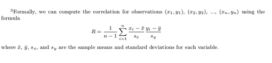
Figure 6.1 gives examples of different correlation coefficient values for hypothetical numerical variables and . We see that while for a correlation coefficient of -0.75 there is still a negative relationship between and , it is not as strong as the negative relationship between and when the correlation coefficient is -1.
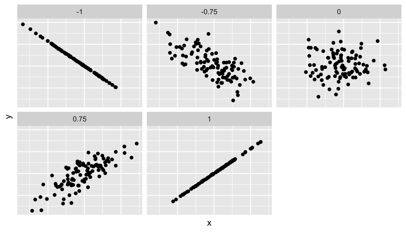
Figure 6.1: Different correlation coefficients
The correlation coefficient is computed using the get_correlation() function in the moderndive package, where in this case the inputs to the function are the two numerical variables from which we want to calculate the correlation coefficient. We place the name of the response variable on the left hand side of the ~ and the explanatory variable on the right hand side of the “tilde.” We will use this same “formula” syntax with regression later in this chapter.
In our case, the correlation coefficient of 0.187 indicates that the relationship between teaching evaluation score and beauty average is “weakly positive.” There is a certain amount of subjectivity in interpreting correlation coefficients, especially those that aren’t close to -1, 0, and 1. For help developing such intuition and more discussion on the correlation coefficient see Subsection 6.3.1 below.
Observe the following:
- Most “beauty” scores lie between 2 and 8.
- Most teaching scores lie between 3 and 5.
- Recall our earlier computation of the correlation coefficient, which describes the strength of the linear relationship between two numerical variables. Looking at Figure 6.3, it is not immediately apparent that these two variables are positively related. This is to be expected given the positive, but rather weak (close to 0), correlation coefficient of 0.187.
Before we continue, we bring to light an important fact about this dataset: it suffers from overplotting.
Recall from the data visualization Subsection 3.3.2 that overplotting occurs when several points are stacked directly on top of each other thereby obscuring the number of points. For example, let’s focus on the 6 points in the top-right of the plot with a beauty score of around 8 out of 10: are there truly only 6 points, or are there many more just stacked on top of each other? You can think of these as ties. Let’s break up these ties with a little random “jitter” added to the points in Figure 6.3.
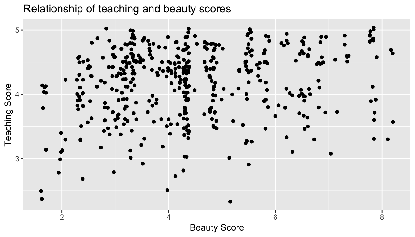
Figure 6.3: Instructor evaluation scores at UT Austin: Jittered
Jittering adds a little random bump to each of the points to break up these ties: just enough so you can distinguish them, but not so much that the plot is overly altered. Furthermore, jittering is strictly a visualization tool; it does not alter the original values in the dataset.
Let’s compare side-by-side the regular scatterplot in Figure 6.2 with the jittered scatterplot in Figure 6.3 in Figure 6.4.
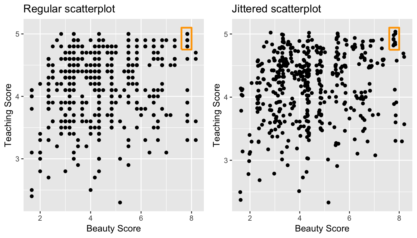
Figure 6.4: Comparing regular and jittered scatterplots.
We make several further observations:
- Focusing our attention on the top-right of the plot again, as noted earlier where there seemed to only be 6 points in the regular scatterplot, we see there were in fact really 9 as seen in the jittered scatterplot.
- A further interesting trend is that the jittering revealed a large number of instructors with beauty scores of between 3 and 4.5, towards the lower end of the beauty scale.
Going forward for simplicity’s sake however, we’ll only present regular scatterplot rather than the jittered scatterplots; we’ll only keep the overplotting in mind whenever looking at such plots. Going back to scatterplot in Figure 6.2, let’s improve on it by adding a “regression line” in Figure 6.5. This is easily done by adding a new layer to the ggplot code that created Figure 6.3: + geom_smooth(method = "lm").
A regression line is a “best fitting” line in that of all possible lines you could draw on this plot, it is “best” in terms of some mathematical criteria. We discuss the criteria for “best” in Subsection 6.3.3 below, but we suggest you read this only after covering the concept of a residual coming up in Subsection 6.1.3.
ggplot(evals_ch6, aes(x = bty_avg, y = score)) +
  geom_point() +
  labs(x = "Beauty Score", y = "Teaching Score",
       title = "Relationship of teaching and beauty scores") +
  geom_smooth(method = "lm")
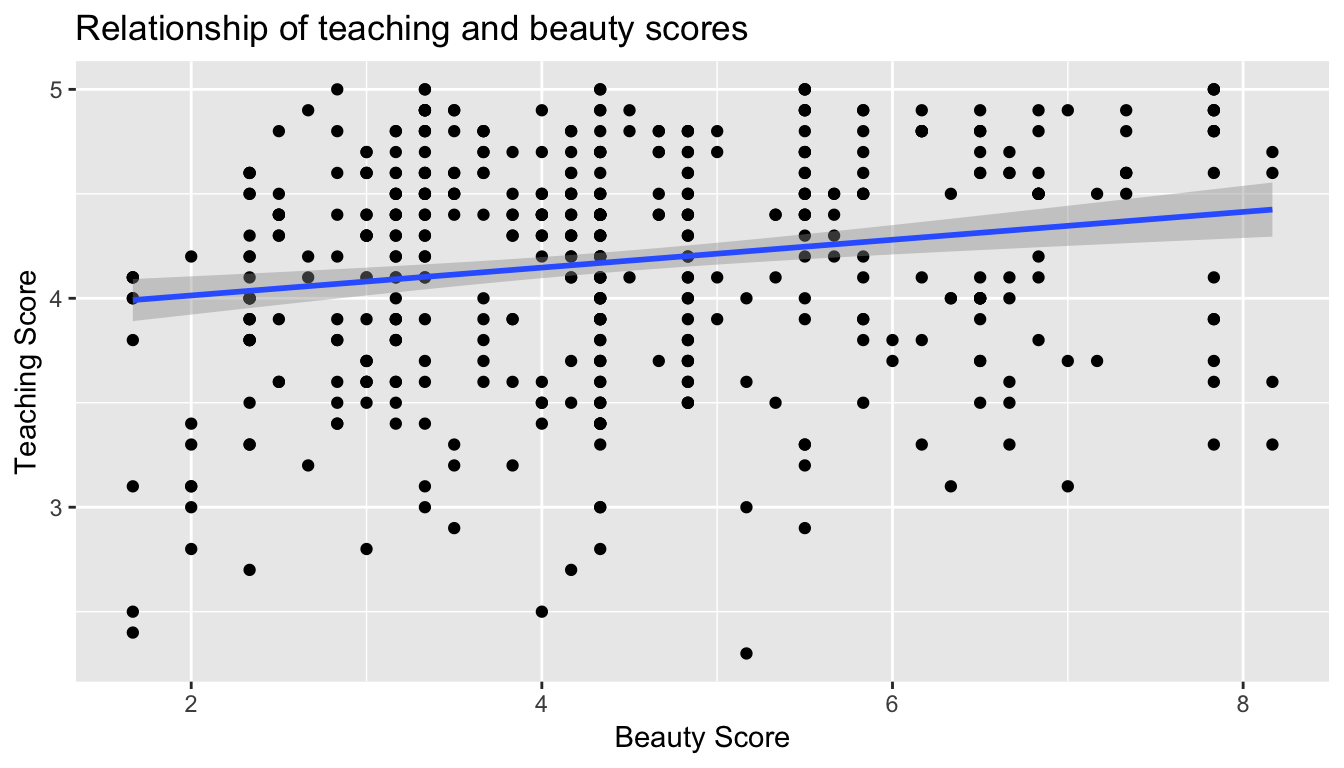
Figure 6.5: Regression line
When viewed on this plot, the regression line is a visual summary of the relationship between two numerical variables, in our case the outcome variable score and the explanatory variable bty_avg. The positive slope of the blue line is consistent with our observed correlation coefficient of 0.187 suggesting that there is a positive relationship between score and bty_avg. We’ll see later however that while the correlation coefficient is not equal to the slope of this line, they always have the same sign: positive or negative.
What are the grey bands surrounding the blue line? These are standard error bands, which can be thought of as error/uncertainty bands. Let’s skip this idea for now and suppress these grey bars for now by adding the argument se = FALSE to geom_smooth(method = "lm"). We’ll introduce standard errors in Chapter 8 on sampling, use them for constructing confidence intervals and conducting hypothesis tests in Chapters 9 and 10, and consider them when we revisit regression in Chapter 11.
ggplot(evals_ch6, aes(x = bty_avg, y = score)) +
  geom_point() +
  labs(x = "Beauty Score", y = "Teaching Score",
       title = "Relationship of teaching and beauty scores") +
  geom_smooth(method = "lm", se = FALSE)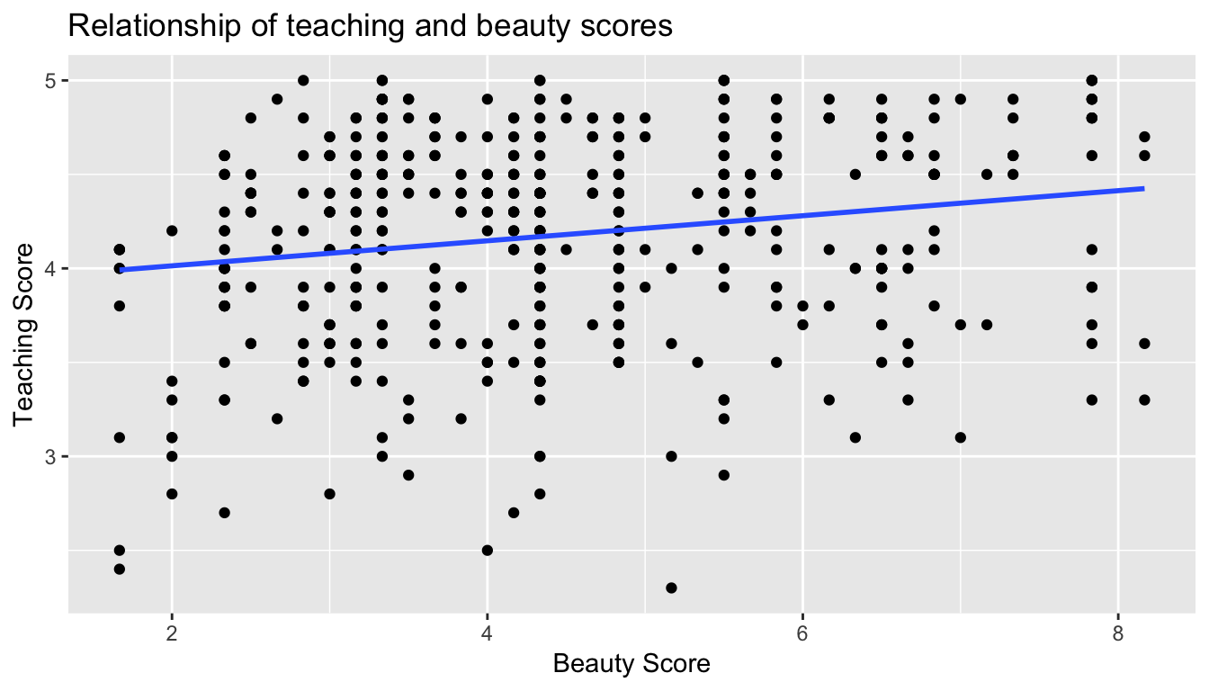
Figure 6.6: Regression line without error bands
Conducting an exploratory data analysis involves three things:
- Looking at the raw values.
- Computing summary statistics of the variables of interest.
- Creating informative visualizations.
Fitting a line by eye
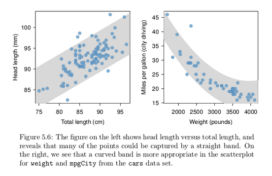
We want to describe the relationship between the head length and total length variables in the possum data set using a line. In this example, we will use the total length as the predictor variable, x, to predict a possum’s head length, y. We could fit the linear relationship by eye, as in Figure 5.7. The equation for this line is
ŷ = 41 + 0.59x
Caution: Watch out for curved trends
We only consider models based on straight lines in this chapter. If data show a nonlinear trend, like that in the right panel of Figure 5.6, more advanced techniques should be used.
Simple linear regression
You may recall from secondary school / high school algebra, in general, the equation of a line is , which is defined by two coefficients. Recall we defined this earlier as “quantitative expressions of a specific property of a phenomenon.” These two coefficients are:
- the intercept coefficient , or the value of when , and the slope coefficient , or the increase in for every increase of one in .
However, when defining a line specifically for regression, like the blue regression line in Figure 6.6, we use slightly different notation: the equation of the regression line is where
- the intercept coefficient is , or the value of when , and the slope coefficient , or the increase in for every increase of one in .
Why do we put a “hat” on top of the ? It’s a form of notation commonly used in regression, which we’ll introduce in the next Subsection 6.1.3 when we discuss fitted values. For now, let’s ignore the hat and treat the equation of the line as you would from secondary school / high school algebra recognizing the slope and the intercept. We know looking at Figure 6.6 that the slope coefficient corresponding to bty_avg should be positive. Why? Because as bty_avg increases, professors tend to roughly have larger teaching evaluation scores. However, what are the specific values of the intercept and slope coefficients? Let’s not worry about computing these by hand, but instead let the computer do the work for us. Specifically let’s use R!
Let’s get the value of the intercept and slope coefficients by outputting something called the linear regression table. We will fit the linear regression model to the data using the lm() function and save this to score_model. lm stands for “linear model”, given that we are dealing with lines. When we say “fit”, we are saying find the best fitting line to this data.
The lm() function that “fits” the linear regression model is typically used as lm(y ~ x, data = data_frame_name) where:
yis the outcome variable, followed by a tilde (~). This is likely the key to the left of “1” on your keyboard. In our case,yis set toscore.xis the explanatory variable. In our case,xis set tobty_avg. We call the combinationy ~ xa model formula. Recall the use of this notation when we computed the correlation coefficient using theget_correlation()function in Subsection 6.1.1.data_frame_nameis the name of the data frame that contains the variablesyandx. In our case,data_frame_nameis theevals_ch6data frame.
score_model <- lm(score ~ bty_avg, data = evals_ch6)
score_model
Call:
lm(formula = score ~ bty_avg, data = evals_ch6)

Coefficients:
(Intercept)      bty_avg
     3.8803       0.0666
This output is telling us that the Intercept coefficient of the regression line is 3.8803 and the slope coefficient for by_avg is 0.0666. Therefore the blue regression line in Figure 6.6 is
where
- The intercept coefficient means for instructors that had a hypothetical beauty score of 0, we would expect them to have on average a teaching score of 3.8803. In this case however, while the intercept has a mathematical interpretation when defining the regression line, there is no practical interpretation since
scoreis an average of a panel of 6 students’ ratings from 1 to 10, abty_avgof 0 would be impossible. Furthermore, no instructors had a beauty score anywhere near 0 in this data.
-
Of more interest is the slope coefficient associated with
bty_avg: . This is a numerical quantity that summarizes the relationship between the outcome and explanatory variables. Note that the sign is positive, suggesting a positive relationship between beauty scores and teaching scores, meaning as beauty scores go up, so also do teaching scores go up. The slope’s precise interpretation is:For every increase of 1 unit in
bty_avg, there is an associated increase of, on average, 0.0666 units ofscore.
Such interpretations need be carefully worded:
- We only stated that there is an associated increase, and not necessarily a causal increase. For example, perhaps it’s not that beauty directly affects teaching scores, but instead individuals from wealthier backgrounds tend to have had better education and training, and hence have higher teaching scores, but these same individuals also have higher beauty scores. Avoiding such reasoning can be summarized by the adage “correlation is not necessarily causation.” In other words, just because two variables are correlated, it doesn’t mean one directly causes the other. We discuss these ideas more in Subsection 6.3.2.
- We say that this associated increase is on average 0.0666 units of teaching
scoreand not that the associated increase is exactly 0.0666 units ofscoreacross all values ofbty_avg. This is because the slope is the average increase across all points as shown by the regression line in Figure 6.6.
Now that we’ve learned how to compute the equation for the blue regression line in Figure 6.6 and interpreted all its terms, let’s take our modeling one step further. This time after fitting the model using the lm(), let’s get something called the regression table using the get_regression_table() function from the moderndive package.
Note how we took the output of the model fit saved in score_model and used it as an input to the subsequent get_regression_table() function. The output now looks like a table: in fact it is a data frame. The values of the intercept and slope of 3.880 and 0.0666 are now in the estimate column.
But what are the remaining 5 columns: std_error, statistic, p_value, lower_ci and upper_ci? What do they tell us?
They tell us about both the statistical significance and practical significance of our model results. You can think of this loosely as the “meaningfulness” of the results from a statistical perspective.
We are going to put aside these ideas for now and revisit them in Chapter 11 on (statistical) inference for regression, after we’ve had a chance to cover:
- Standard errors in Chapter 8 (
std_error) - Confidence intervals in Chapter 9 (
lower_ciandupper_ci) - Hypothesis testing in Chapter 10 (
statisticandp_value).
For now, we’ll only focus on the term and estimate columns of any regression table.
The get_regression_table() from the moderndive is an example of what’s known as a wrapper function in computer programming, which takes other pre-existing functions and “wraps” them into a single function. This concept is illustrated in Figure 6.7.
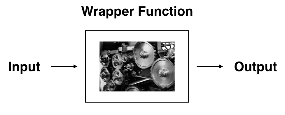
So all you need to worry about is what the inputs look like and what the outputs look like; you leave all the other details “under the hood of the car.” In our regression modeling example, the get_regression_table() has
- Input: A saved
lm()linear regression - Output: A data frame with information on the intercept and slope of the regression line.
If you’re interested in learning more about the get_regression_table() function’s construction and thinking, see Subsection 6.3.4 below.
Observed/fitted values and residuals
We just saw how to get the value of the intercept and the slope of the regression line from the regression table generated by get_regression_table(). Now instead, say we want information on individual points. In this case, we focus on one of the instructors in this dataset, corresponding to a single row of evals_ch6.
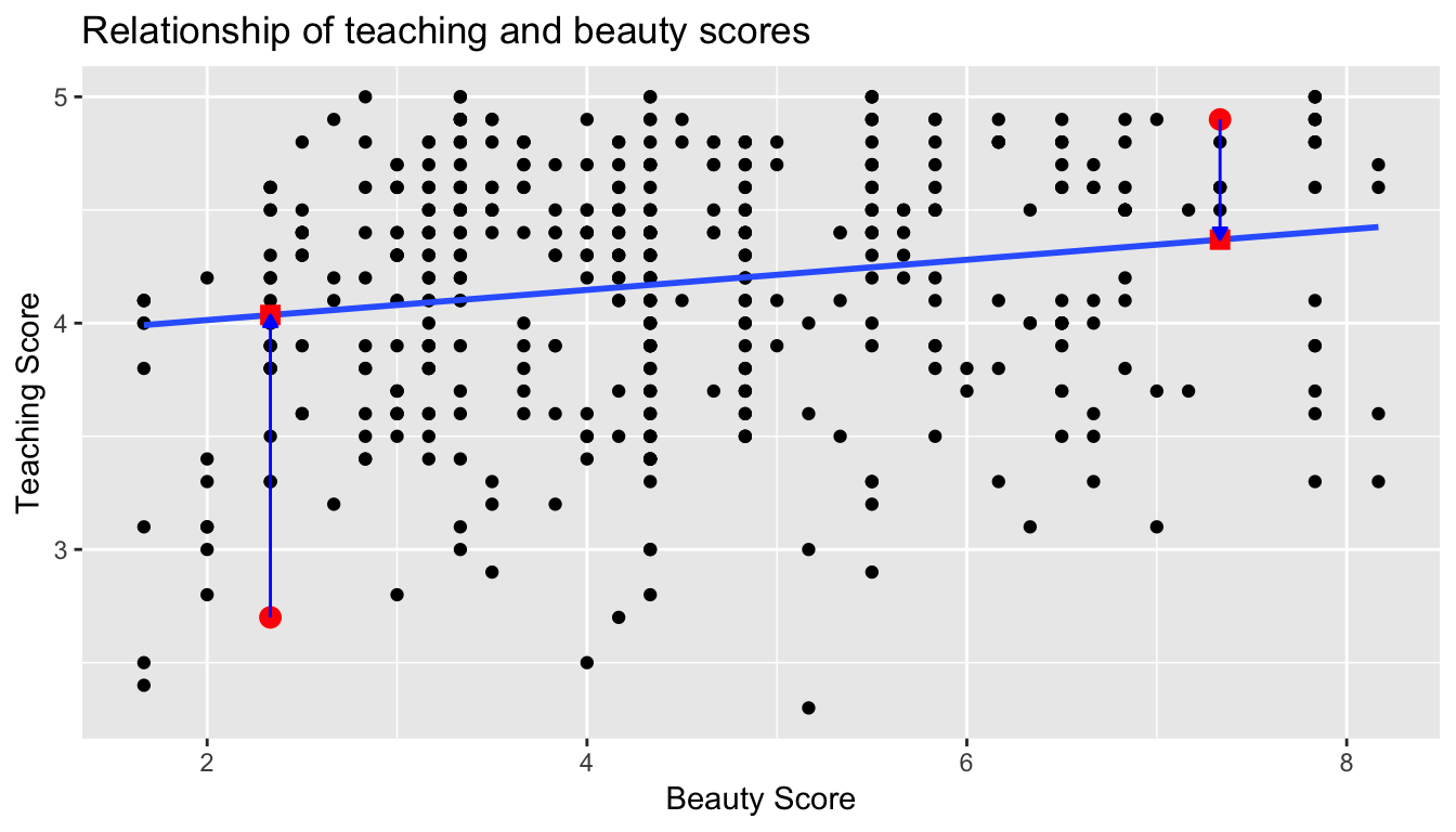
For example, say we are interested in the 21st instructor in this dataset:
| score | bty_avg | age |
|---|---|---|
| 4.9 | 7.33 | 31 |
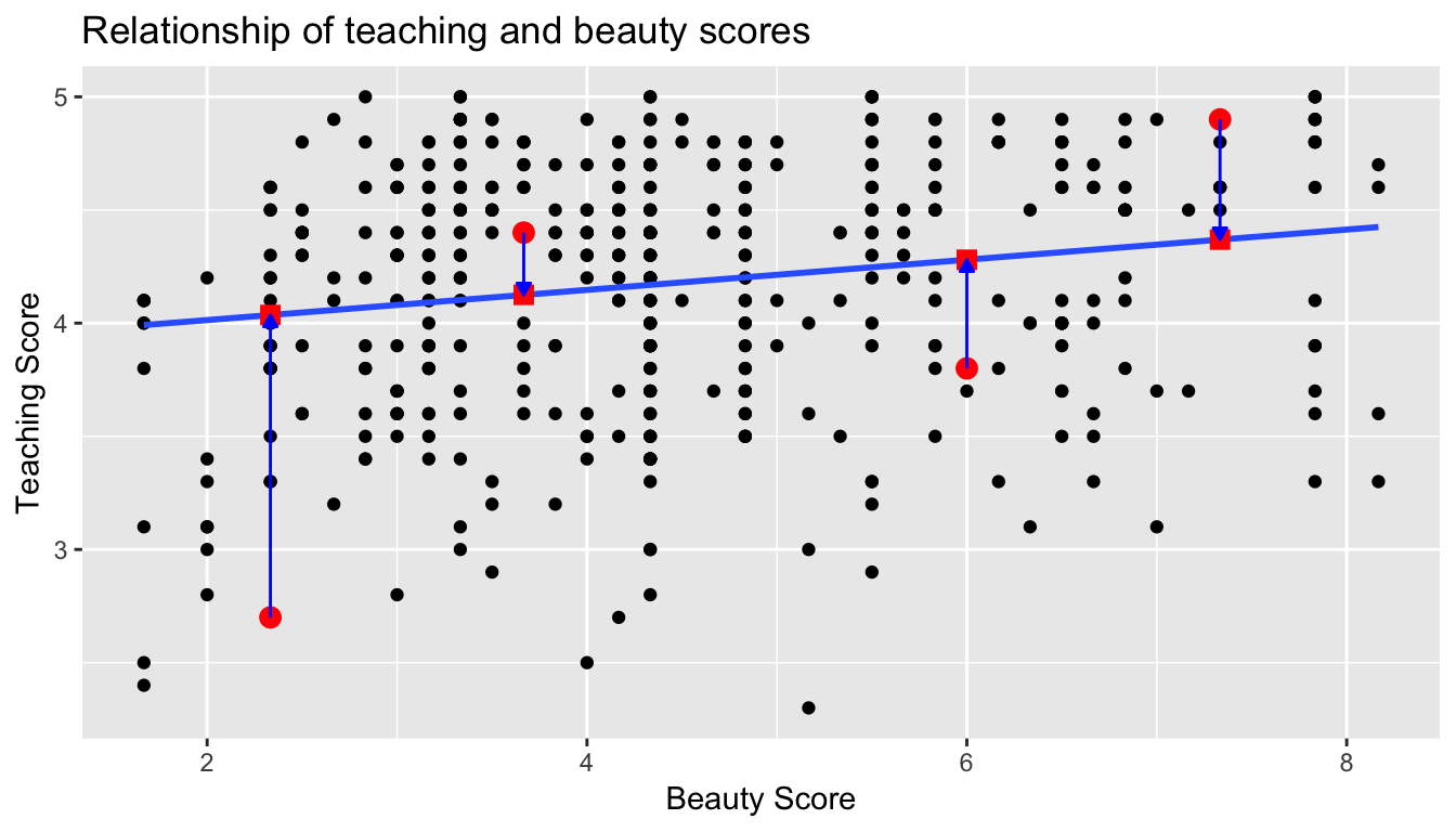
What is the value on the blue line corresponding to this instructor’s bty_avg of 7.333? In Figure 6.8 we mark three values in particular corresponding to this instructor.
- Red circle: This is the observed value = 4.9 and corresponds to this instructor’s actual teaching score.
- Red square: This is the fitted valueand corresponds to the value on the regression line for = 7.333. This value is computed using the intercept and slope in the regression table above:
- Blue arrow: The length of this arrow is the residual and is computed by subtracting the fitted value from the observed value . The residual can be thought of as the error or “lack of fit” of the regression line. In the case of this instructor, it is = 4.9 - 4.369 = 0.531. In other words, the model was off by 0.531 teaching score units for this instructor.
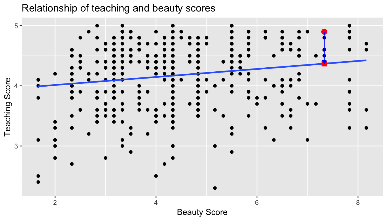
Figure 6.8: Example of observed value, fitted value, and residual
What if we want both
- the fitted value
- and the residual
not only the 21st instructor but for all 463 instructors in the study? Recall that each instructor corresponds to one of the 463 rows in the evals_ch6 data frame and also one of the 463 points in the regression plot in Figure 6.6.
We could repeat the above calculations by hand 463 times, but that would be tedious and time consuming. Instead, let’s use the get_regression_points() function that we’ve included in the moderndive R package. Note that in the table below we only present the results for the 21st through the 24th instructors.
Just as with the get_regression_table() function, the inputs to the get_regression_points() function are the same, however the outputs are different. Let’s inspect the individual columns:
- The
scorecolumn represents the observed value of the outcome variable . - The
bty_avgcolumn represents the values of the explanatory variable . - The
score_hatcolumn represents the fitted values . - The
residualcolumn represents the residuals .
get_regression_points() is another example of a wrapper function we described in Figure 6.7. If you’re curious about this function as well, check out Subsection 6.3.4.
Just as we did for the 21st instructor in the evals_ch6 dataset (in the first row of the table above), let’s repeat the above calculations for the 24th instructor in the evals_ch6 dataset (in the fourth row of the table above):
score= 4.4 is the observed value for this instructor.bty_avg= 5.50 is the value of the explanatory variable for this instructor.score_hat= 4.25 = 3.88 + 0.067 * = 3.88 + 0.067 * 5.50 is the fitted value for this instructor.residual= 0.153 = 4.4 - 4.25 is the value of the residual for this instructor. In other words, the model was off by 0.153 teaching score units for this instructor.
More development of this idea appears in Section 6.3.3 and we encourage you to read that section after you investigate residuals.
Fitting a line by least squares regression
An objective measure for finding the best line
We begin by thinking about what we mean by “best”. Mathematically, we want a line that has small residuals. Perhaps our criterion could minimize the sum of the residual magnitudes:
|e 1 | + |e 2 | + · · · + |e n | (5.9)
which we could accomplish with a computer program. The resulting dashed line shown in Figure 5.12 demonstrates this fit can be quite reasonable. However, a more common practice is to choose the line that minimizes the sum of the squared residuals:
e 21 + e 22 + · · · + e 2 n (5.10)
The line that minimizes this least squares criterion is represented as the solid line in Figure 5.12. This is commonly called the least squares line. The following are three possible reasons to choose Criterion (5.10) over Criterion (5.9):
1. It is the most commonly used method.
2. Computing the line based on Criterion (5.10) is much easier by hand and in most statistical software.
3. In many applications, a residual twice as large as another residual is more than twice as bad. For example, being off by 4 is usually more than twice as bad as being off by 2. Squaring the residuals accounts for this discrepancy.
The first two reasons are largely for tradition and convenience; the last reason explains why Criterion (5.10) is typically most helpful. There are applications where Criterion (5.9) may be more useful, and there are plenty of other criteria we might consider. However, this book only applies the least squares criterion.
Finding the least squares line
For the Elmhurst data, we could write the equation of the least squares regression line as
c = β0 + β1 × family income aid
Here the equation is set up to predict gift aid based on a student’s family income, which would be useful to students considering Elmhurst. These two values, β 0 and β 1 , are the parameters of the regression line.
As in Chapters 4-6, the parameters are estimated using observed data. In practice, this estimation is done using a computer in the same way that other estimates, like a sample mean, can be estimated using a computer or calculator. However, we can also find the parameter estimates by applying two properties of the least squares line:
• The slope of the least squares line can be estimated by
b1 = (sy / sx) R (5.11)
where R is the correlation between the two variables, and sx and sy are the sample standard deviations of the explanatory variable and response, respectively.
• If x̄ is the mean of the horizontal variable (from the data) and ȳ is the mean of the vertical variable, then the point (x̄, ȳ) is on the least squares line.
We use b0 and b1 to represent the point estimates of the parameters β0 and β1.
Residual analysis
Residuals are helpful in evaluating how well a linear model fits a data set. We often display them in a residual plot. One purpose of residual plots is to identify characteristics or patterns still apparent in data after fitting a model. Figure 5.9 shows three scatterplots with linear models in the first row and residual plots in the second row. Can you identify any patterns remaining in the residuals?
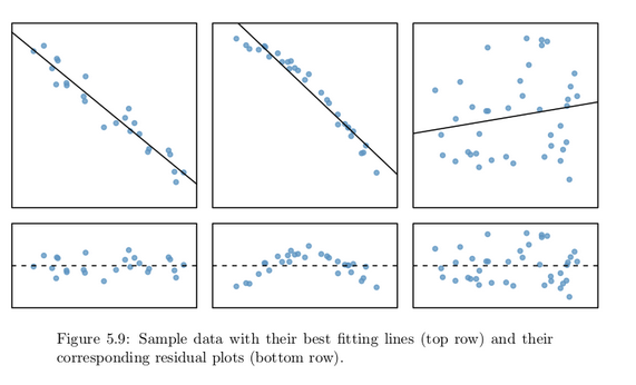
In the first data set (first column), the residuals show no obvious patterns. The residuals appear to be scattered randomly around the dashed line that represents 0.
The second data set shows a pattern in the residuals. There is some curvature in the scatterplot, which is more obvious in the residual plot. We should not use a straight line to model these data. Instead, a more advanced technique should be used.
The last plot shows very little upwards trend, and the residuals also show no obvious patterns. It is reasonable to try to fit a linear model to the data. However, it is unclear whether there is statistically significant evidence that the slope parameter is different from zero. The point estimate of the slope parameter, labeled b1 , is not zero, but we might wonder if this could just be due to chance. We will address this sort of
scenario in Section 5.4.
Recall the residuals can be thought of as the error or the “lack-of-fit” between the observed value and the fitted value on the blue regression line in Figure 6.6.
Ideally when we fit a regression model, we’d like there to be no systematic pattern to these residuals. We’ll be more specific as to what we mean by no systematic pattern when we see Figure 6.10 below, but let’s keep this notion imprecise for now. Investigating any such patterns is known as residual analysis and is the theme of this section.
We’ll perform our residual analysis in two ways:
-
Creating a scatterplot with the residuals on the -axis and the original explanatory variable on the -axis.
-
Creating a histogram of the residuals, thereby showing the distribution of the residuals.
First, recall in Figure 6.8 above we created a scatterplot where
- on the vertical axis we had the teaching score ,
- on the horizontal axis we had the beauty score , and
- the blue arrow represented the residual for one particular instructor.
Instead, in Figure 6.9 below, let’s create a scatterplot where
- On the vertical axis we have the residual instead
- On the horizontal axis we have the beauty score as before.
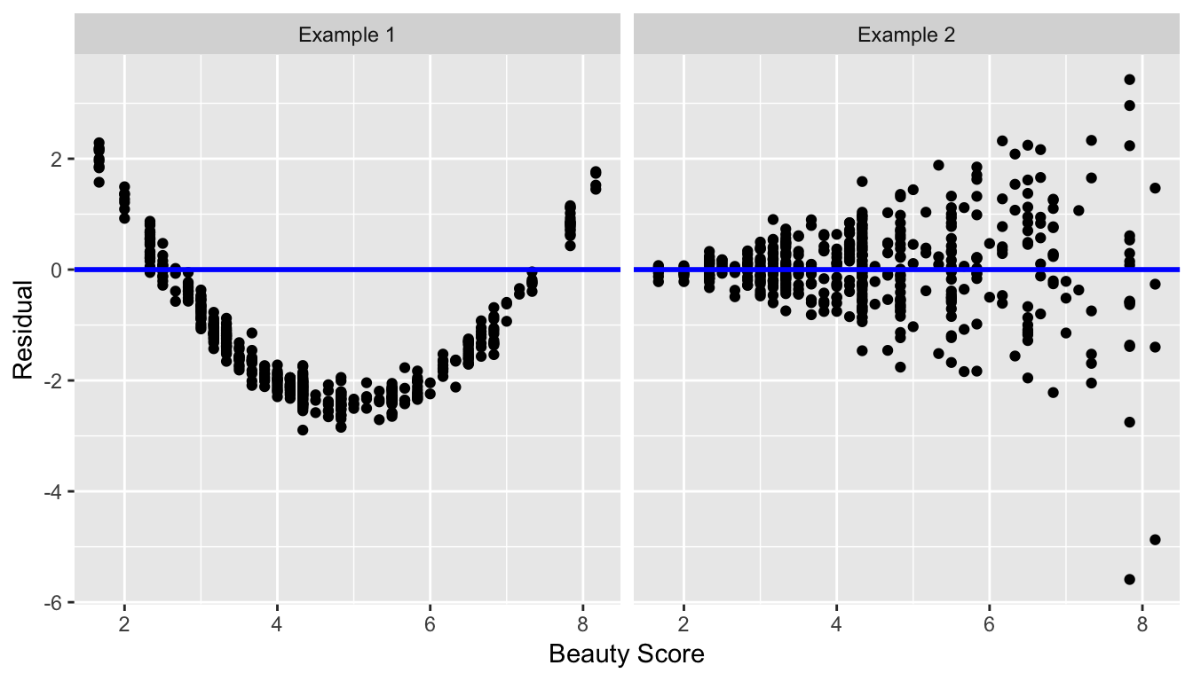
You can think of Figure 6.9 as Figure 6.8 but with the blue line flattened out to . Does it seem like there is no systematic pattern to the residuals? This question is rather qualitative and subjective in nature, thus different people may respond with different answers to the above question. However, it can be argued that there isn’t a drastic pattern in the residuals.
Let’s now get a little more precise in our definition of no systematic pattern in the residuals. Ideally, the residuals should behave randomly. In addition,
-
the residuals should be on average 0. In other words, sometimes the regression model will make a positive error in that , sometimes the regression model will make a negative error in that , but on average the error is 0.
-
Further, the value and spread of the residuals should not depend on the value of .
In Figure 6.10 below, we display some hypothetical examples where there are drastic patterns to the residuals. In Example 1, the value of the residual seems to depend on : the residuals tend to be positive for small and large values of in this range, whereas values of more in the middle tend to have negative residuals. In Example 2, while the residuals seem to be on average 0 for each value of , the spread of the residuals varies for different values of ; this situation is known as heteroskedasticity.
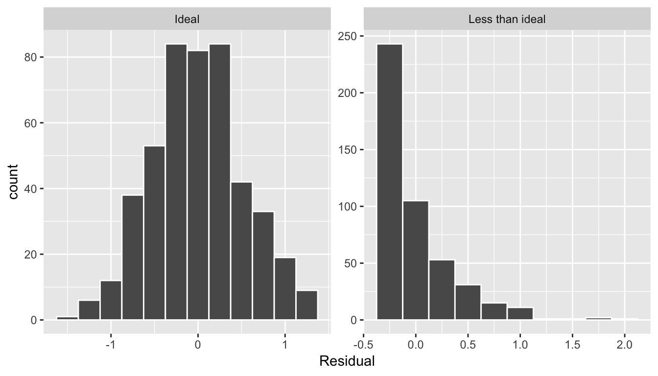
std error, statistic, p_value,lower_ci, and upper_ci) to have valid interpretations, the above three conditions should roughly hold.Related topics
Correlation coefficient
Let’s re-plot Figure 6.1, but now consider a broader range of correlation coefficient values in Figure 6.18.
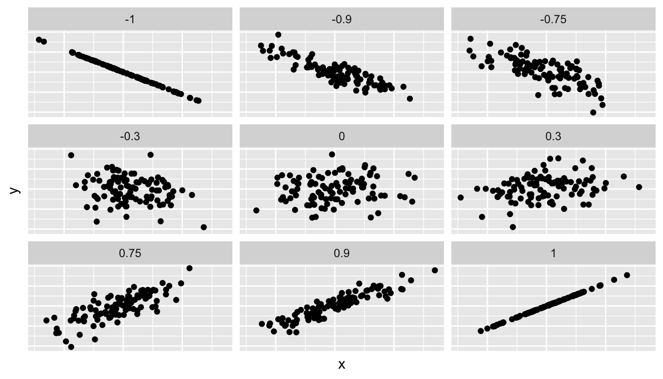
Figure 6.18: Different Correlation Coefficients
As we suggested in Subsection 6.1.1, interpreting coefficients that are not close to the extreme values of -1 and 1 can be subjective. To develop your sense of correlation coefficients, we suggest you play the following 80’s-style video game called “Guess the correlation”! Click on the image below to do so:

Correlation is not necessarily causation
You’ll note throughout this chapter we’ve been very cautious in making statements of the “associated effect” of explanatory variables on the outcome variables, for example our statement from Subsection 6.1.2 that “for every increase of 1 unit in bty_avg, there is an associated increase of, on average, 18.802 units of score.” We stay this because we are careful not to make causal statements. So while beauty score bty_avg is positively correlated with teaching score, does it directly cause effects on teaching score.
For example, let’s say an instructor has their bty_avg reevaluated, but only after taking steps to try to boost their beauty score. Does this mean that they will suddenly be a better instructor? Or will they suddenly get higher teaching scores? Maybe?
Here is another example, a not-so-great medical doctor goes through their medical records and finds that patients who slept with their shoes on tended to wake up more with headaches. So this doctor declares “Sleeping with shoes on cause headaches!”
However as some of you might have guessed, if someone is sleeping with their shoes on its probably because they are intoxicated. Furthermore, drinking more tends to cause more hangovers, and hence more headaches.
In this instance, alcohol is what’s known as a confounding/lurking variable. It “lurks” behind the scenes, confounding or making less apparent, the causal effect (if any) of “sleeping with shoes on” with waking up with a headache. We can summarize this notion in Figure 6.20 with a causal graph where:
- Y: Is an outcome variable, here “waking up with a headache.”
- X: Is a treatment variable whose causal effect we are interested in, here “sleeping with shoes on.”
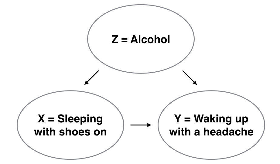
Figure 6.20: Causal graph.
So for example, many such studies use regression modeling where the outcome variable is set to Y and the explanatory/predictor variable is X, much as you’ve started learning how to do in this chapter. However, Figure 6.20 also includes a third variable with arrows pointing at both X and Y.
- Z: Is a confounding variable that effects both X & Y, thus “confounding” their relationship.
So as we said, alcohol will both cause people to be more likely to sleep with their shoes on as well as more likely to wake up with a headache. Thus when evaluating what causes one to wake up with a headache, it's hard to tease out the effect of sleeping with shoes on versus just the alcohol. Thus our model needs to also use Z as an explanatory/predictor variable as well, in other words our doctor needs to take into account who had been drinking the night before. We’ll start covering multiple regression models that allow us to incorporate more than one variable in the next chapter.
Establishing causation is a tricky problem and frequently takes either carefully designed experiments or methods to control for the effects of potential confounding variables.
Both these approaches attempt either to remove all confounding variables or take them into account as best they can, and only focus on the behavior of an outcome variable in the presence of the levels of the other variable(s). Be careful as you read studies to make sure that the writers aren’t falling into this fallacy of correlation implying causation. If you spot one, you may want to send them a link to Spurious Correlations.
Best fitting line
Regression lines are also known as “best fitting lines”. But what do we mean by best? Let’s unpack the criteria that is used by regression to determine best. Recall the plot in Figure 6.8 where for a instructor with a beauty average score of
- The observed value was marked with a red circle
- The fitted value on the regression line was marked with a red square
- The residual was the length of the blue arrow.
Let’s do this for another arbitrarily chosen instructor whose beauty score was . The residual in this case is .
Another arbitrarily chosen instructor whose beauty score was results in the residual in this case being .
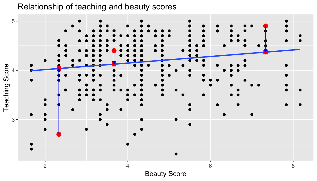
Let’s do this one more time for another arbitrarily chosen instructor. This instructor had a beauty score of . The residual in this case is .
Now let’s say we repeated this process for all 463 instructors in our dataset. Regression minimizes the sum of all 463 arrow lengths squared.
In other words, it minimizes the sum of the squared residuals:
We square the arrow lengths so that positive and negative deviations of the same amount are treated equally. That’s why alternative names for the simple linear regression line are the least-squares line and the best fitting line. It can be proven via calculus and linear algebra that this line uniquely minimizes the sum of the squared arrow lengths.
For the regression line in the plot, the sum of the squared residuals is 131.879. This is the lowest possible value of the sum of the squared residuals of all possible lines we could draw on this scatterplot? How do we know this? We can mathematically prove this fact, but this requires some calculus and linear algebra, so let’s leave this proof for another course!
Leverage: Points that fall horizontally away from the center of the cloud tend to pull harder on the line, so we call them points with high leverage. If one of these high leverage points does appear to actually invoke its influence on the slope of the line – as in cases (3), (4), and (5) of Example 5.22 – then we call it an influential point. Usually we can say a point is influential if, had we fitted the line without it, the influential point would have been unusually far from the least squares line. It is tempting to remove outliers. Don’t do this without a very good reason. Models that ignore exceptional (and interesting) cases often perform poorly. Whatever final model is fit to the data would not be very helpful if
it ignores the most exceptional cases.
Caution: Outliers for a categorical predictor with two levels
Be cautious about using a categorical predictor when one of the levels has very few observations. When this happens, those few observations become influential points.
Using R to describe the strength of a fit
We evaluated the strength of the linear relationship between two variables earlier using the correlation, R. However, it is more common to explain the strength of a linear fit using R**2, called R-squared. If provided with a linear model, we might like to describe how closely the data cluster around the linear fit.
The R**2 of a linear model describes the amount of variation in the response that is explained by the least squares line. For example, consider the Elmhurst data, shown in Figure 5.15. The variance of the response variable, aid received, is
s**2aid= 29.8.
However, if we apply our least squares line, then this model reduces our uncertainty in predicting aid using a student’s family income. The variability in the residuals describes how much
variation remains after using the model:
s**2RES= 22.4.
In short, there was a reduction of
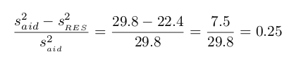
or about 25% in the data’s variation by using information about family income for predicting aid using a linear model. This corresponds exactly to the R-squared value:
R=−0.499 R**2= 0.25
get_regression_x() functions
What is going on behind the scenes with the get_regression_table() get_regression_points() from the moderndive package? Recall we introduced
- In Subsection 6.1.2, the
get_regression_table()function that returned a regression table. - In Subsection 6.1.3, the
get_regression_points()function that returned information on all points/observations involved in a regression?
and that these were examples of wrapper functions that takes other pre-existing functions and “wraps” them in a single function. This way all the user needs to worry about is the input and the output format, and ignore what’s “under the hood.” In this subsection we “lift the hood” and see how the engine of these wrapper functions work.
If you’re even more curious, take a look at the source code for these functions on GitHub.
First, the get_regression_table() wrapper function leverages the
- the
tidy()function in thebroompackage and - the
clean_names()function in thejanitorpackage
to generate tidy data frames with information about a regression model.