Chapter 5.2 Exploratory Data Analysis
Introduction
This chapter will show you how to use visualisation and transformation to explore your data in a systematic way, a task that statisticians call exploratory data analysis, or EDA for short. EDA is an iterative cycle. You:
-
Generate questions about your data.
-
Search for answers by visualising, transforming, and modelling your data.
-
Use what you learn to refine your questions and/or generate new questions.
EDA is not a formal process with a strict set of rules. More than anything, EDA is a state of mind. During the initial phases of EDA you should feel free to investigate every idea that occurs to you. Some of these ideas will pan out, and some will be dead ends. As your exploration continues, you will home in on a few particularly productive areas that you’ll eventually write up and communicate to others.
EDA is an important part of any data analysis, even if the questions are handed to you on a platter, because you always need to investigate the quality of your data.
Data cleaning is just one application of EDA: you ask questions about whether your data meets your expectations or not. To do data cleaning, you’ll need to deploy all the tools of EDA: visualisation, transformation, and modelling.
Questions
“There are no routine statistical questions, only questionable statistical routines.” — Sir David Cox
“Far better an approximate answer to the right question, which is often vague, than an exact answer to the wrong question, which can always be made precise.” — John Tukey
Your goal during EDA is to develop an understanding of your data. The easiest way to do this is to use questions as tools to guide your investigation. When you ask a question, the question focuses your attention on a specific part of your dataset and helps you decide which graphs, models, or transformations to make.
EDA is fundamentally a creative process. And like most creative processes, the key to asking quality questions is to generate a large quantity of questions. It is difficult to ask revealing questions at the start of your analysis because you do not know what insights are contained in your dataset. On the other hand, each new question that you ask will expose you to a new aspect of your data and increase your chance of making a discovery. You can quickly drill down into the most interesting parts of your data—and develop a set of thought-provoking questions—if you follow up each question with a new question based on what you find.
There is no rule about which questions you should ask to guide your research. However, two types of questions will always be useful for making discoveries within your data. You can loosely word these questions as:
-
What type of variation occurs within my variables?
-
What type of covariation occurs between my variables?
The rest of this chapter will look at these two questions. I’ll explain what variation and covariation are, and I’ll show you several ways to answer each question. To make the discussion easier, let’s define some terms:
-
A variable is a quantity, quality, or property that you can measure.
-
A value is the state of a variable when you measure it. The value of a variable may change from measurement to measurement.
-
An observation is a set of measurements made under similar conditions (you usually make all of the measurements in an observation at the same time and on the same object). An observation will contain several values, each associated with a different variable. I’ll sometimes refer to an observation as a data point.
-
Tabular data is a set of values, each associated with a variable and an observation. Tabular data is tidy if each value is placed in its own “cell”, each variable in its own column, and each observation in its own row.
So far, all of the data that you’ve seen has been tidy. In real-life, most data isn’t tidy, so we’ll come back to these ideas again in tidy data.
Variation
Variation is the tendency of the values of a variable to change from measurement to measurement. You can see variation easily in real life; if you measure any continuous variable twice, you will get two different results. This is true even if you measure quantities that are constant, like the speed of light. Each of your measurements will include a small amount of error that varies from measurement to measurement. Categorical variables can also vary if you measure across different subjects (e.g. the eye colors of different people), or different times (e.g. the energy levels of an electron at different moments). Every variable has its own pattern of variation, which can reveal interesting information. The best way to understand that pattern is to visualise the distribution of the variable’s values.
Visualising distributions
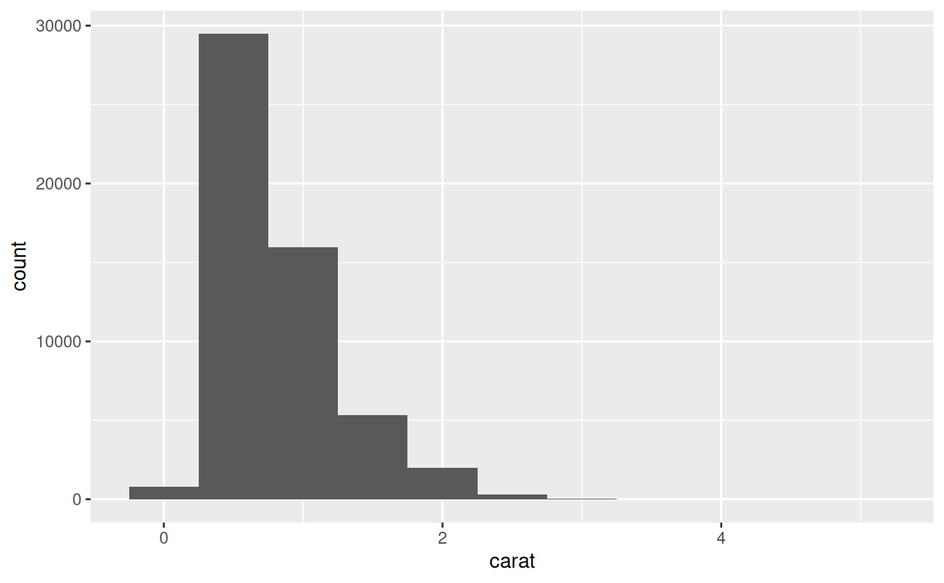
A histogram divides the x-axis into equally spaced bins and then uses the height of a bar to display the number of observations that fall in each bin. In the graph above, the tallest bar shows that almost 30,000 observations have a carat value between 0.25 and 0.75, which are the left and right edges of the bar.
You can set the width of the intervals in a histogram with the binwidth argument, which is measured in the units of the x variable. You should always explore a variety of binwidths when working with histograms, as different binwidths can reveal different patterns.
If you wish to overlay multiple histograms in the same plot, I recommend using geom_freqpoly() instead of geom_histogram(). geom_freqpoly() performs the same calculation as geom_histogram(), but instead of displaying the counts with bars, uses lines instead. It’s much easier to understand overlapping lines than bars.
ggplot(data = smaller, mapping = aes(x = carat, colour = cut)) +
  geom_freqpoly(binwidth = 0.1)
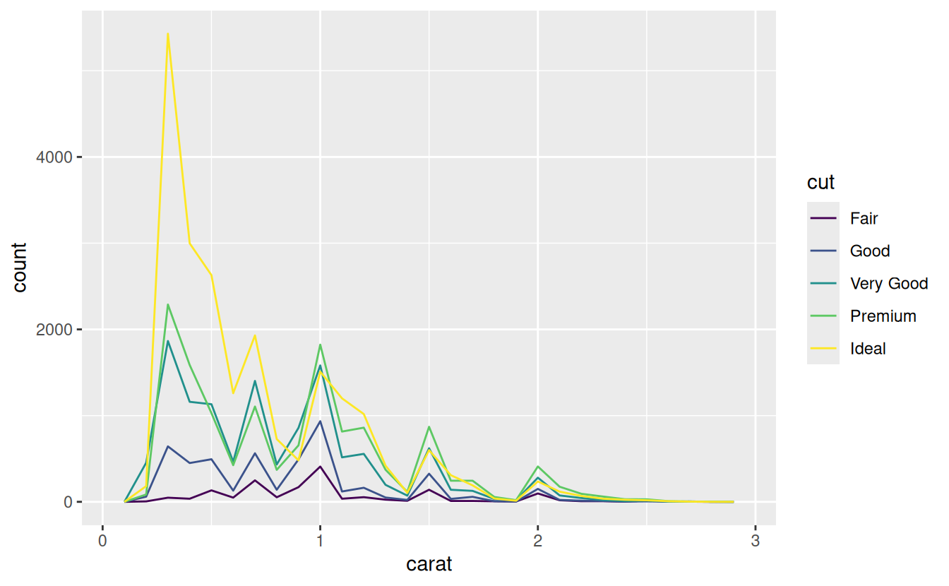
There are a few challenges with this type of plot, which we will come back to in visualising a categorical and a continuous variable.
Now that you can visualise variation, what should you look for in your plots? And what type of follow-up questions should you ask?
I’ve put together a list below of the most useful types of information that you will find in your graphs, along with some follow-up questions for each type of information. The key to asking good follow-up questions will be to rely on your curiosity (What do you want to learn more about?) as well as your skepticism (How could this be misleading?).
Typical values
In both bar charts and histograms, tall bars show the common values of a variable, and shorter bars show less-common values. Places that do not have bars reveal values that were not seen in your data. To turn this information into useful questions, look for anything unexpected:
-
Which values are the most common? Why?
-
Which values are rare? Why? Does that match your expectations?
-
Can you see any unusual patterns? What might explain them?
Clusters of similar values suggest that subgroups exist in your data. To understand the subgroups, ask:
-
How are the observations within each cluster similar to each other?
-
How are the observations in separate clusters different from each other?
-
How can you explain or describe the clusters?
-
Why might the appearance of clusters be misleading?
Unusual values
Outliers are observations that are unusual; data points that don’t seem to fit the pattern. Sometimes outliers are data entry errors; other times outliers suggest important new science.
When you have a lot of data, outliers are sometimes difficult to see in a histogram. For example, take the distribution of the y variable from the diamonds dataset. The only evidence of outliers is the unusually wide limits on the x-axis.
(coord_cartesian() also has an xlim() argument for when you need to zoom into the x-axis. ggplot2 also has xlim() and ylim() functions that work slightly differently: they throw away the data outside the limits.)
This allows us to see that there are three unusual values: 0, ~30, and ~60. We pluck them out with dplyr:
unusual <- diamonds %>%
  filter(y < 3 | y > 20) %>%
  select(price, x, y, z) %>%
  arrange(y)
unusual
#> # A tibble: 9 x 4
#>   price     x     y     z
#>   <int> <dbl> <dbl> <dbl>
#> 1  5139  0      0    0
#> 2  6381  0      0    0
#> 3 12800  0      0    0
#> 4 15686  0      0    0
#> 5 18034  0      0    0
#> 6  2130  0      0    0
#> 7  2130  0      0    0
#> 8  2075  5.15  31.8  5.12
#> 9 12210  8.09  58.9  8.06
The y variable measures one of the three dimensions of these diamonds, in mm. We know that diamonds can’t have a width of 0mm, so these values must be incorrect. We might also suspect that measurements of 32mm and 59mm are implausible: those diamonds are over an inch long, but don’t cost hundreds of thousands of dollars!
It’s good practice to repeat your analysis with and without the outliers. If they have minimal effect on the results, and you can’t figure out why they’re there, it’s reasonable to replace them with missing values, and move on. However, if they have a substantial effect on your results, you shouldn’t drop them without justification. You’ll need to figure out what caused them (e.g. a data entry error) and disclose that you removed them in your write-up.
Learning more
If you want to learn more about the mechanics of ggplot2, I’d highly recommend grabbing a copy of the ggplot2 book: https://amzn.com/331924275X. It’s been recently updated, so it includes dplyr and tidyr code, and has much more space to explore all the facets of visualisation. Unfortunately the book isn’t generally available for free, but if you have a connection to a university you can probably get an electronic version for free through SpringerLink.
Another useful resource is the R Graphics Cookbook by Winston Chang. Much of the contents are available online at http://www.cookbook-r.com/Graphs/.
I also recommend Graphical Data Analysis with R, by Antony Unwin. This is a book-length treatment similar to the material covered in this chapter, but has the space to go into much greater depth.
Covariation
If variation describes the behavior within a variable, covariation describes the behavior between variables. Covariation is the tendency for the values of two or more variables to vary together in a related way. The best way to spot covariation is to visualise the relationship between two or more variables. How you do that should again depend on the type of variables involved.
A categorical and continuous variable
It’s common to want to explore the distribution of a continuous variable broken down by a categorical variable, as in the previous frequency polygon. The default appearance of geom_freqpoly() is not that useful for that sort of comparison because the height is given by the count. That means if one of the groups is much smaller than the others, it’s hard to see the differences in shape.
For example, let’s explore how the price of a diamond varies with its quality:
ggplot(data = diamonds, mapping = aes(x = price)) +
  geom_freqpoly(mapping = aes(colour = cut), binwidth = 500)
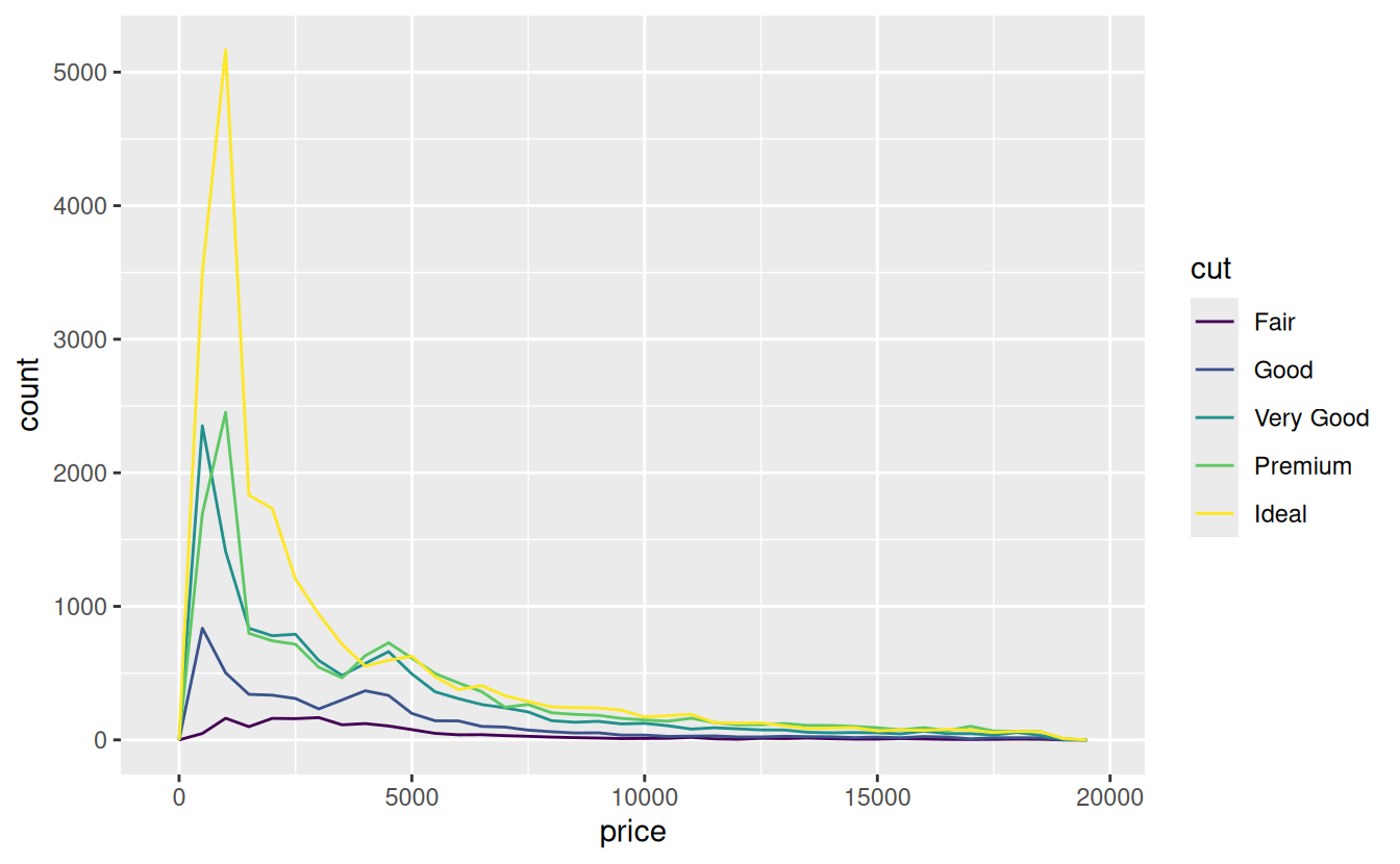
It’s hard to see the difference in distribution because the overall counts differ so much:
ggplot(diamonds) +
  geom_bar(mapping = aes(x = cut))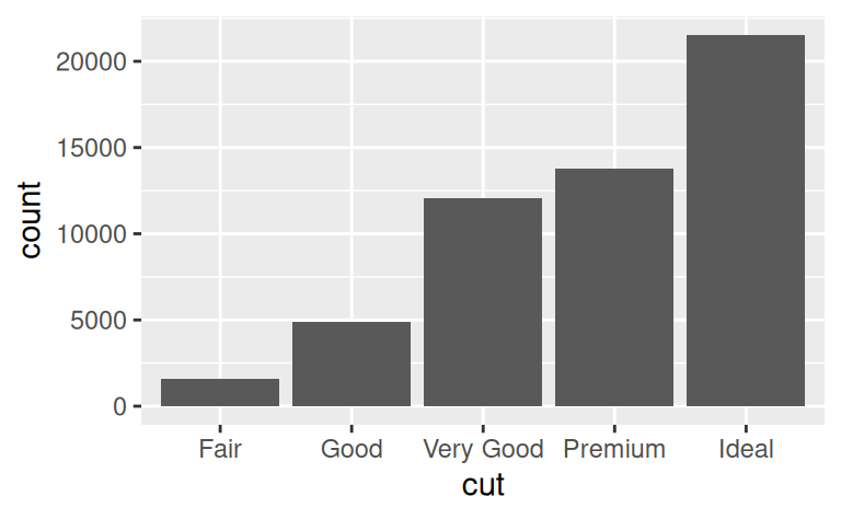
To make the comparison easier we need to swap what is displayed on the y-axis. Instead of displaying count, we’ll display density, which is the count standardised so that the area under each frequency polygon is one.
ggplot(data = diamonds, mapping = aes(x = price, y = ..density..)) +
  geom_freqpoly(mapping = aes(colour = cut), binwidth = 500)

There’s something rather surprising about this plot - it appears that fair diamonds (the lowest quality) have the highest average price! But maybe that’s because frequency polygons are a little hard to interpret - there’s a lot going on in this plot.
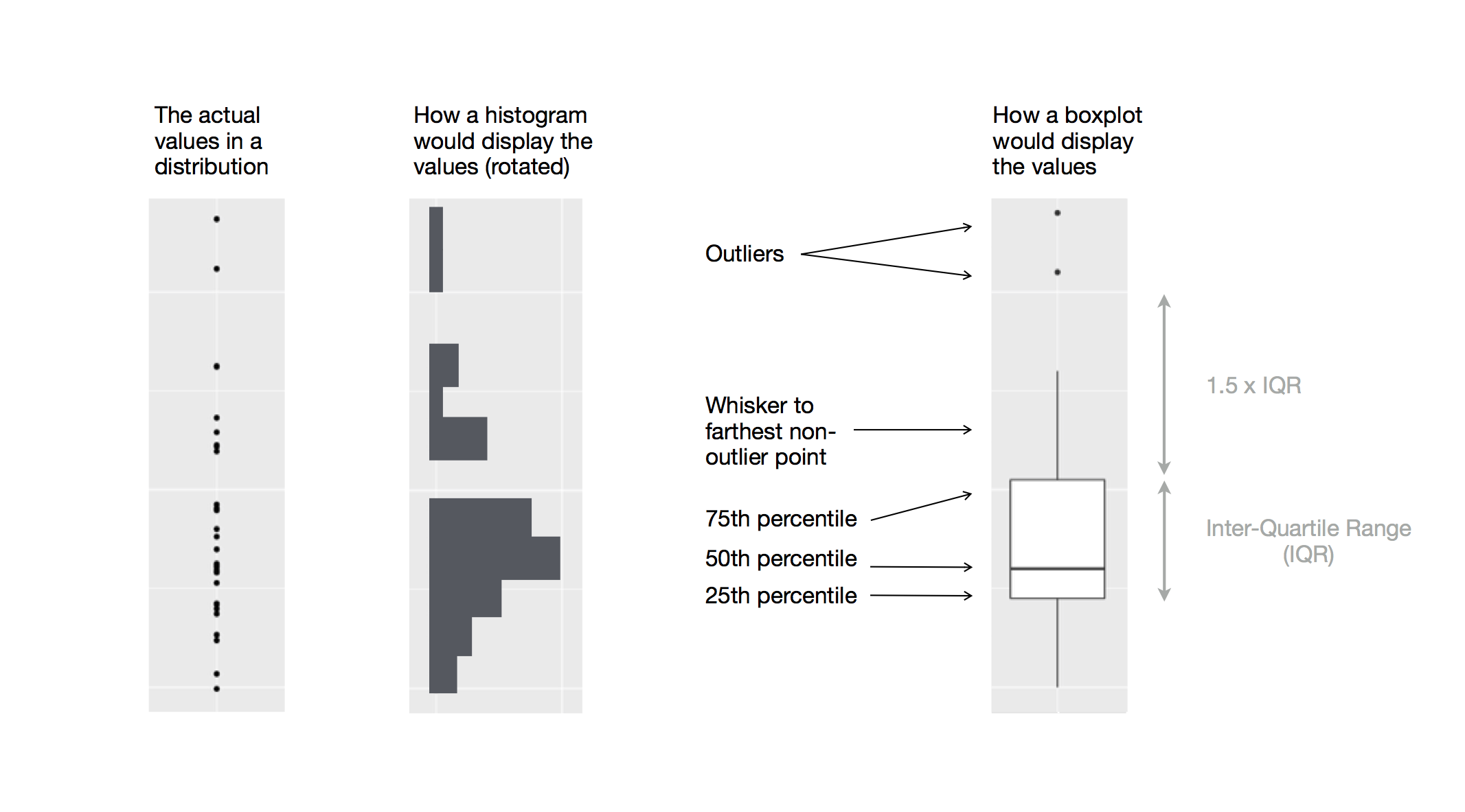
Another alternative to display the distribution of a continuous variable broken down by a categorical variable is the boxplot. A boxplot is a type of visual shorthand for a distribution of values that is popular among statisticians. Each boxplot consists of:
-
A box that stretches from the 25th percentile of the distribution to the 75th percentile, a distance known as the interquartile range (IQR). In the middle of the box is a line that displays the median, i.e. 50th percentile, of the distribution. These three lines give you a sense of the spread of the distribution and whether or not the distribution is symmetric about the median or skewed to one side.
-
Visual points that display observations that fall more than 1.5 times the IQR from either edge of the box. These outlying points are unusual so are plotted individually.
-
A line (or whisker) that extends from each end of the box and goes to the farthest non-outlier point in the distribution.
We see much less information about the distribution, but the boxplots are much more compact so we can more easily compare them (and fit more on one plot). It supports the counterintuitive finding that better quality diamonds are cheaper on average! In the exercises, you’ll be challenged to figure out why.
cut is an ordered factor: fair is worse than good, which is worse than very good and so on. Many categorical variables don’t have such an intrinsic order, so you might want to reorder them to make a more informative display. One way to do that is with the reorder() function.
ggplot2 calls
As we move on from these introductory chapters, we’ll transition to a more concise expression of ggplot2 code. So far we’ve been very explicit, which is helpful when you are learning:
ggplot(data = faithful, mapping = aes(x = eruptions)) +
  geom_freqpoly(binwidth = 0.25)
Typically, the first one or two arguments to a function are so important that you should know them by heart. The first two arguments to ggplot() are data and mapping, and the first two arguments to aes()are x and y.
In the remainder of the book, we won’t supply those names. That saves typing, and, by reducing the amount of boilerplate, makes it easier to see what’s different between plots. That’s a really important programming concern that we’ll come back in functions.
Rewriting the previous plot more concisely yields:
ggplot(faithful, aes(eruptions)) +
  geom_freqpoly(binwidth = 0.25)
Sometimes we’ll turn the end of a pipeline of data transformation into a plot. Watch for the transition from %>% to +. I wish this transition wasn’t necessary but unfortunately ggplot2 was created before the pipe was discovered.
diamonds %>%
  count(cut, clarity) %>%
  ggplot(aes(clarity, cut, fill = n)) +
    geom_tile()
Patterns and models
Patterns in your data provide clues about relationships. If a systematic relationship exists between two variables it will appear as a pattern in the data. If you spot a pattern, ask yourself:
-
Could this pattern be due to coincidence (i.e. random chance)?
-
How can you describe the relationship implied by the pattern?
-
How strong is the relationship implied by the pattern?
-
What other variables might affect the relationship?
-
Does the relationship change if you look at individual subgroups of the data?
A scatterplot of Old Faithful eruption lengths versus the wait time between eruptions shows a pattern: longer wait times are associated with longer eruptions. The scatterplot also displays the two clusters that we noticed above.
Patterns provide one of the most useful tools for data scientists because they reveal covariation. If you think of variation as a phenomenon that creates uncertainty, covariation is a phenomenon that reduces it.
If two variables covary, you can use the values of one variable to make better predictions about the values of the second. If the covariation is due to a causal relationship (a special case), then you can use the value of one variable to control the value of the second.
Models are a tool for extracting patterns out of data. For example, consider the diamonds data. It’s hard to understand the relationship between cut and price, because cut and carat, and carat and price are tightly related. It’s possible to use a model to remove the very strong relationship between price and carat so we can explore the subtleties that remain.