Chapter 4.1 Base Packages
Clustered barplot
If you want to create a clustered barplot, with different bars for different groups of data, you can enter a matrix as the argument to height. R will then plot each column of the matrix as a separate set of bars.
For example, let’s say I conducted an experiment where I compared how fast pirates can swim under four conditions: Wearing clothes versus being naked, and while being chased by a shark versus not being chased by a shark. Let’s say I conducted this experiment and calculated the following average swimming speed:
| Naked | Clothed | |
|---|---|---|
| No Shark | 2.1 | 1.5 |
| Shark | 3.0 | 3.0 |
gray()
| Argument | Description |
|---|---|
level |
Lightness: level = 1 = totally white, level = 0 = totally black |
alpha |
Transparency: alpha = 0 = totally transparent, alpha = 1 = not transparent at all. |
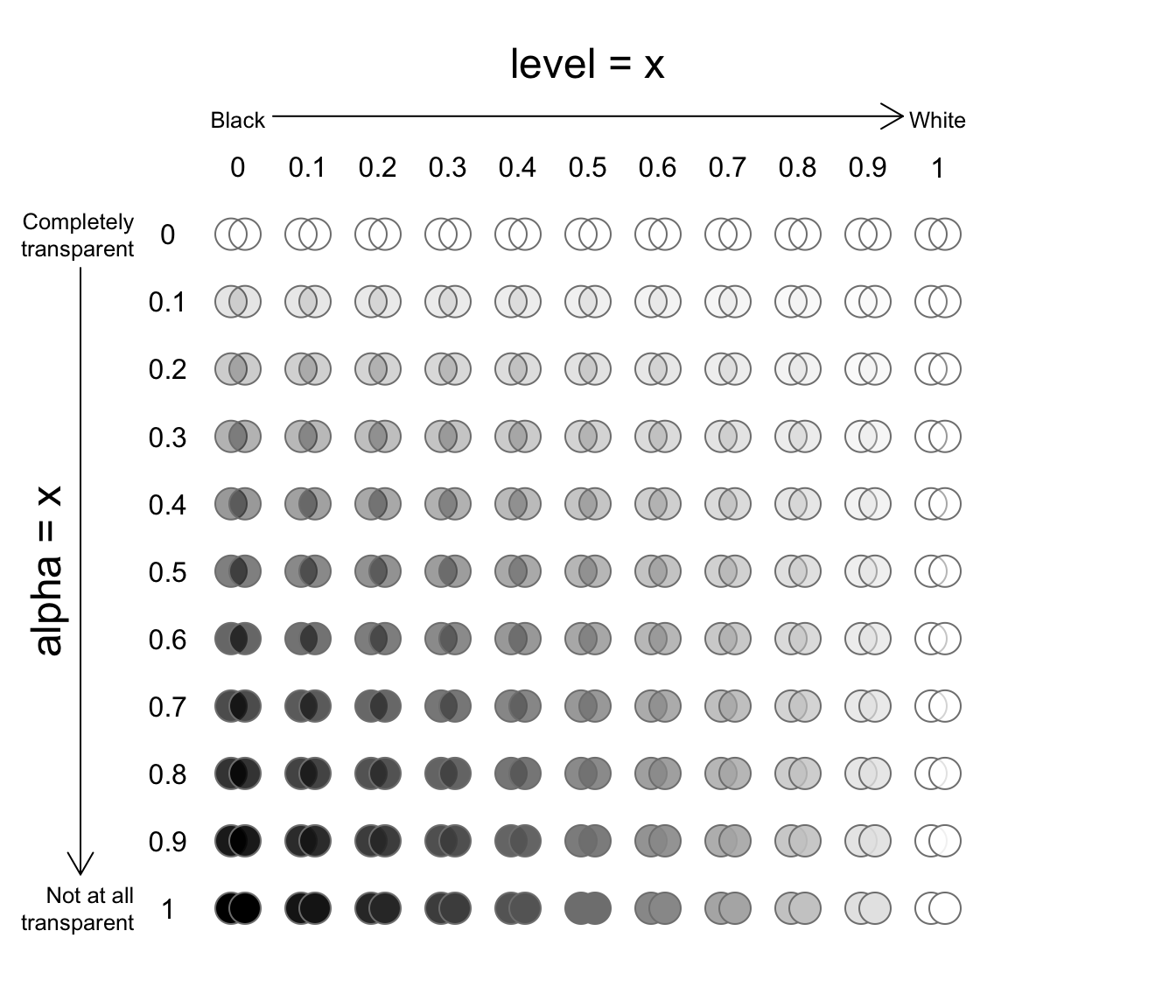
Figure 11.3: Examples of gray(level, alpha)
The gray() function takes two arguments, level and alpha, and returns a shade of gray. For example, gray(level = 1) will return white. The second alpha argument specifies how transparent to make the color on a scale from 0 (completely transparent), to 1 (not transparent at all). The default value for alpha is 1 (not transparent at all). See Figure 11.3 for examples.
yarrr::transparent()
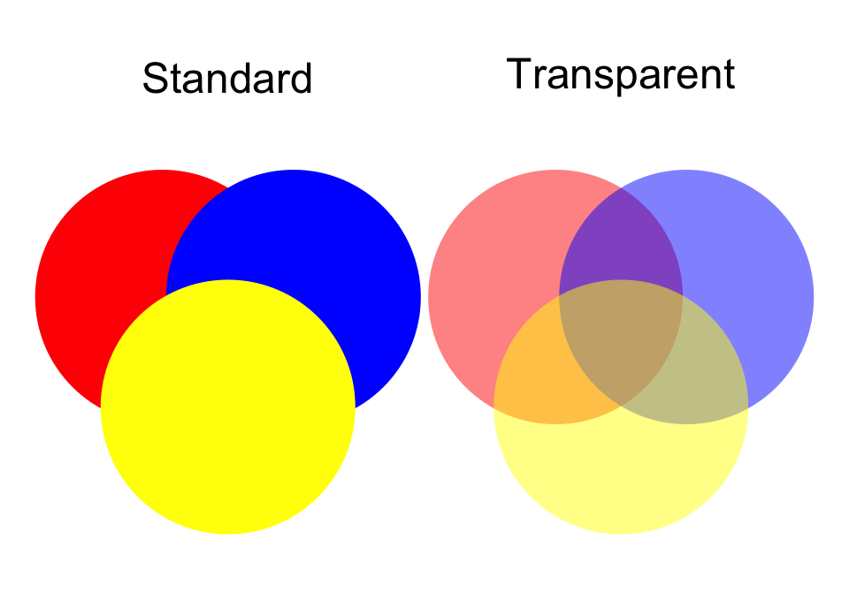
Unfortunately, as far as I know, base-R does not make it easy to make transparent colors. Thankfully, there is a function in the yarrr package called transparent that makes it very easy to make any color transparent. To use it, just enter the original color as the main argument orig.col, then enter how transparent you want to make it (from 0 to 1) as the second argument trans.val.
pirateplot()
| Argument | Description |
|---|---|
formula |
A formula specifying a y-axis variable as a function of 1, 2 or 3 x-axis variables. For example, formula = weight ~ Diet + Time will plot weight as a function of Diet and Time |
data |
A dataframe containing the variables specified in formula |
theme |
A plotting theme, can be an integer from 1 to 4. Setting theme = 0 will turn off all plotting elements so you can then turn them on individually. |
pal |
The color palette. Can either be a named color palette from the piratepal() function (e.g. "basel", "xmen", "google") or a standard R color. For example, make a black and white plot, set pal = "black" |
cap.beans |
If cap.beans = TRUE, beans will be cut off at the maximum and minimum data values |
A pirateplot is a plot contained in the yarrr package written specifically by and for R pirates. The pirateplot is an easy-to-use function that, unlike barplots and boxplots, can easily show raw data, descriptive statistics, and inferential statistics in one plot. Figure 11.5 shows the four key elements in a pirateplot:
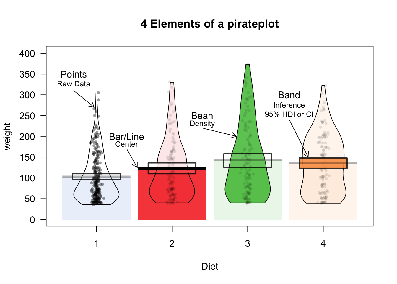
Figure 11.5: The pirateplot(), an R pirate’s favorite plot!
| Element | Description |
|---|---|
| Points | Raw data. |
| Bar / Line | Descriptive statistic, usually the mean or median |
| Bean | Smoothed density curve showing the full data distribution. |
| Band | Inference around the mean, either a Bayesian Highest Density Interval (HDI), or a Confidence Interval (CI) |
The two main arguments to pirateplot() are formula and data. In formula, you specify plotting variables in the form y ~ x, where y is the name of the dependent variable, and x is the name of the independent variable. In data, you specify the name of the dataframe object where the variables are stored.
Customizing pirateplots
Regardless of the theme you use, you can always customize the color and opacity of graphical elements. To do this, specify one of the following arguments. Note: Arguments with .f. correspond to the filling of an element, while .b. correspond to the border of an element:
| element | color | opacity |
|---|---|---|
| points | point.col, point.bg | point.o |
| beans | bean.f.col, bean.b.col | bean.f.o, bean.b.o |
| bar | bar.f.col, bar.b.col | bar.f.o, bar.b.o |
| inf | inf.f.col, inf.b.col | inf.f.o, inf.b.o |
| avg.line | avg.line.col | avg.line.o |
There are many additional arguments to pirateplot() that you can use to complete customize the look of your plot. To see them all, look at the help menu with ?pirateplot or look at the vignette at
| Element | Argument | Examples |
|---|---|---|
| Background color | back.col | back.col = 'gray(.9, .9)' |
| Gridlines | gl.col, gl.lwd, gl.lty | gl.col = 'gray', gl.lwd = c(.75, 0), gl.lty = 1 |
| Quantiles | quant, quant.lwd, quant.col | quant = c(.1, .9), quant.lwd = 1, quant.col = 'black' |
| Average line | avg.line.fun | avg.line.fun = median |
| Inference Calculation | inf.method | inf.method = 'hdi', inf.method = 'ci' |
| Inference Display | inf.disp | inf.disp = 'line', inf.disp = 'bean', inf.disp = 'rect' |
Scatterplot: plot()
The most common high-level plotting function is plot(x, y). The plot() function makes a scatterplot from two vectors x and y, where the x vector indicates the x (horizontal) values of the points, and the y vector indicates the y (vertical) values.
| Argument | Description |
|---|---|
x, y |
Vectors of equal length specifying the x and y values of the points |
type |
Type of plot. "l" means lines, "p" means points, "b" means lines and points, "n" means no plotting |
main, xlab, ylab |
Strings giving labels for the plot title, and x and y axes |
xlim, ylim |
Limits to the axes. For example, xlim = c(0, 100) will set the minimum and maximum of the x-axis to 0 and 100. |
pch |
An integer indicating the type of plotting symbols (see ?points and section below), or a string specifying symbols as text. For example, pch = 21 will create a two-color circle, while pch = "P" will plot the character "P". To see all the different symbol types, run ?points. |
col |
Main color of the plotting symbols. For example col = "red" will create red symbols. |
cex |
A numeric vector specifying the size of the symbols (from 0 to Inf). The default size is 1. cex = 4 will make the points very large, while cex = .5 will make them very small. |
plot(x = 1:10,                         # x-coordinates
     y = 1:10,                         # y-coordinates
     type = "p",                       # Just draw points (no lines)
     main = "My First Plot",
     xlab = "This is the x-axis label",
     ylab = "This is the y-axis label",
     xlim = c(0, 11),                  # Min and max values for x-axis
     ylim = c(0, 11),                  # Min and max values for y-axis
     col = "blue",                     # Color of the points
     pch = 16,                         # Type of symbol (16 means Filled circle)
     cex = 1)                           # Size of the symbols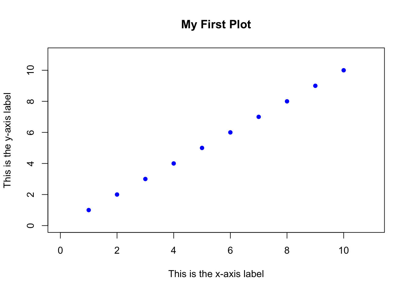
Aside from the x and y arguments, all of the arguments are optional. If you don’t specify a specific argument, then R will use a default value, or try to come up with a value that makes sense. For example, if you don’t specify the xlim and ylim arguments, R will set the limits so that all the points fit inside the plot.
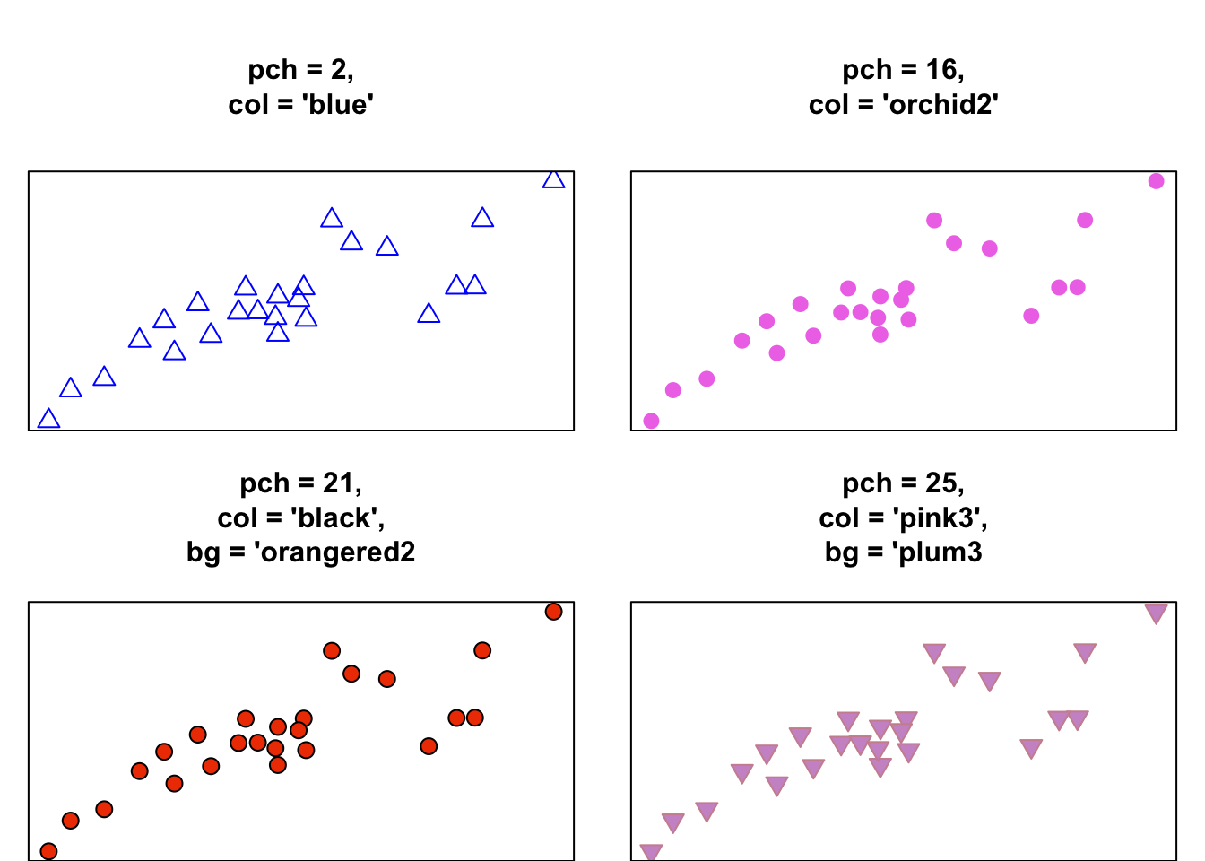
Symbol types: pch
When you create a plot with plot() (or points with points()), you can specify the type of symbol with the pch argument. You can specify the symbol type in one of two ways: with an integer, or with a string. If you use a string (like "p"), R will use that text as the plotting symbol. If you use an integer value, you’ll get the symbol that correspond to that number. See Figure for all the symbol types you can specify with an integer.
Symbols differ in their shape and how they are colored. Symbols 1 through 14 only have borders and are always empty, while symbols 15 through 20 don’t have a border and are always filled. Symbols 21 through 25 have both a border and a filling. To specify the border color or background for symbols 1 through 20, use the col argument. For symbols 21 through 25, you set the color of the border with col, and the color of the background using bg
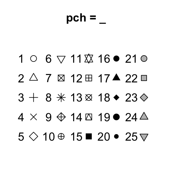
Figure 11.4: The symbol types associated with the pch plotting parameter.
Let’s look at some different symbol types in action when applied to the same data: