Chapter 5.1.3 Correlations
Up to this point we have focused entirely on how to construct descriptive statistics for a single variable. What we haven’t done is talked about how to describe the relationships between variables in the data. To do that, we want to talk mostly about the correlation between variables. But first, we need some data.
The data
After spending so much time looking at the AFL data, I’m starting to get bored with sports. Instead, let’s turn to a topic close to every parent’s heart: sleep. The following data set is fictitious, but based on real events. Suppose I’m curious to find out how much my infant son’s sleeping habits affect my mood. Let’s say that I can rate my grumpiness very precisely, on a scale from 0 (not at all grumpy) to 100 (grumpy as a very, very grumpy old man). And, lets also assume that I’ve been measuring my grumpiness, my sleeping patterns and my son’s sleeping patterns for quite some time now. Let’s say, for 100 days. And, being a nerd, I’ve saved the data as a file called parenthood.Rdata.
to give a graphical depiction of what each of the three interesting variables looks like, Figure 5.6 plots histograms.
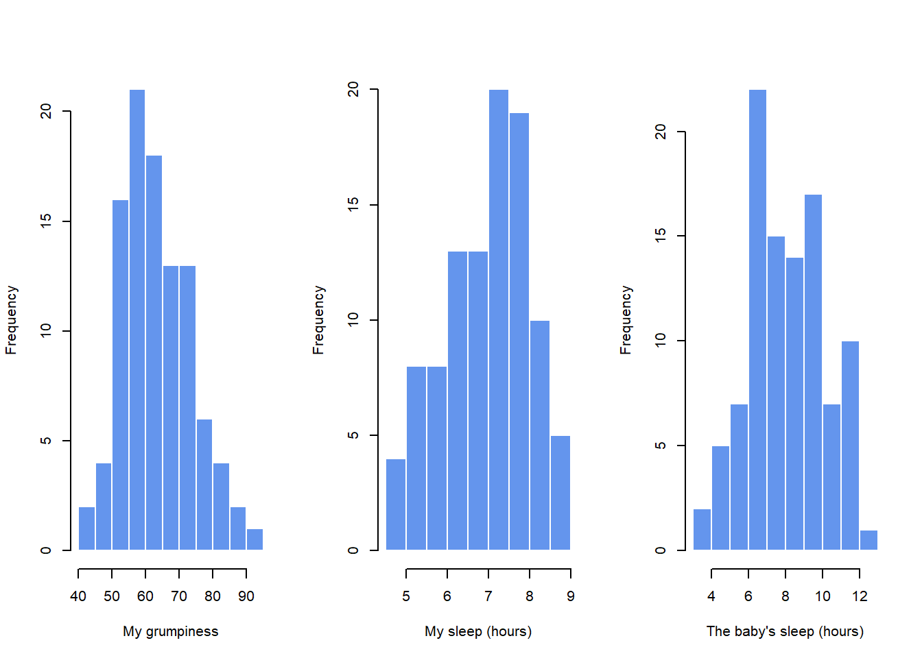
Figure 5.6: Histograms for the three interesting variables in the parenthood data set
One thing to note: just because R can calculate dozens of different statistics doesn’t mean you should report all of them. If I were writing this up for a report, I’d probably pick out those statistics that are of most interest to me (and to my readership), and then put them into a nice, simple table like the one in Table ??.79 Notice that when I put it into a table, I gave everything “human readable” names. This is always good practice. Notice also that I’m not getting enough sleep. This isn’t good practice, but other parents tell me that it’s standard practice.
| variable | min | max | mean | median | std. dev | IQR |
|---|---|---|---|---|---|---|
| Dan’s grumpiness | 41 | 91 | 63.71 | 62 | 10.05 | 14 |
| Dan’s hours slept | 4.84 | 9 | 6.97 | 7.03 | 1.02 | 1.45 |
| Dan’s son’s hours slept | 3.25 | 12.07 | 8.05 | 7.95 | 2.07 | 3.21 |
The correlation coefficient
We can make these ideas a bit more explicit by introducing the idea of a correlation coefficient (or, more specifically, Pearson’s correlation coefficient), which is traditionally denoted by .
The correlation coefficient between two variables and (sometimes denoted ), which we’ll define more precisely in the next section, is a measure that varies from to . When it means that we have a perfect negative relationship, and when it means we have a perfect positive relationship. When , there’s no relationship at all. If you look at Figure 5.10, you can see several plots showing what different correlations look like.
The formula for the Pearson’s correlation coefficient can be written in several different ways. I think the simplest way to write down the formula is to break it into two steps.
Firstly, let’s introduce the idea of a covariance. The covariance between two variables and is a generalisation of the notion of the variance; it’s a mathematically simple way of describing the relationship between two variables that isn’t terribly informative to humans:
Because we’re multiplying (i.e., taking the “product” of) a quantity that depends on by a quantity that depends on and then averaging80, you can think of the formula for the covariance as an “average cross product” between and .
The covariance has the nice property that, if and are entirely unrelated, then the covariance is exactly zero. If the relationship between them is positive (in the sense shown in Figure@reffig:corr) then the covariance is also positive; and if the relationship is negative then the covariance is also negative.
In other words, the covariance captures the basic qualitative idea of correlation. Unfortunately, the raw magnitude of the covariance isn’t easy to interpret: it depends on the units in which and are expressed, and worse yet, the actual units that the covariance itself is expressed in are really weird. For instance, if refers to the dan.sleep variable (units: hours) and refers to the dan.grump variable (units: grumps), then the units for their covariance are “hours grumps”. And I have no freaking idea what that would even mean.
The Pearson correlation coefficient fixes this interpretation problem by standardising the covariance, in pretty much the exact same way that the -score standardises a raw score: by dividing by the standard deviation. However, because we have two variables that contribute to the covariance, the standardisation only works if we divide by both standard deviations.81
In other words, the correlation between and can be written as follows:
By doing this standardisation, not only do we keep all of the nice properties of the covariance discussed earlier, but the actual values of are on a meaningful scale: implies a perfect positive relationship, and implies a perfect negative relationship. I’ll expand a little more on this point later, in Section@refsec:interpretingcorrelations. But before I do, let’s look at how to calculate correlations in R.
Interpreting a correlation
Naturally, in real life you don’t see many correlations of 1. So how should you interpret a correlation of, say ? The honest answer is that it really depends on what you want to use the data for, and on how strong the correlations in your field tend to be.
A friend of mine in engineering once argued that any correlation less than is completely useless (I think he was exaggerating, even for engineering). On the other hand there are real cases – even in psychology – where you should really expect correlations that strong. For instance, one of the benchmark data sets used to test theories of how people judge similarities is so clean that any theory that can’t achieve a correlation of at least really isn’t deemed to be successful. However, when looking for (say) elementary correlates of intelligence (e.g., inspection time, response time), if you get a correlation above you’re doing very very well. In short, the interpretation of a correlation depends a lot on the context. That said, the rough guide in Table ?? is pretty typical.
However, something that can never be stressed enough is that you should always look at the scatterplot before attaching any interpretation to the data. A correlation might not mean what you think it means.
The classic illustration of this is “Anscombe’s Quartet” (??? Anscombe1973), which is a collection of four data sets. Each data set has two variables, an and a . For all four data sets the mean value for is 9 and the mean for is 7.5. The, standard deviations for all variables are almost identical, as are those for the the variables. And in each case the correlation between and is . You can verify this yourself, since the dataset comes distributed with R. The commands would be:
cor( anscombe$x1, anscombe$y1 )## [1] 0.8164205cor( anscombe$x2, anscombe$y2 )## [1] 0.8162365and so on.
You’d think that these four data sets would look pretty similar to one another. They do not. If we draw scatterplots of against for all four variables, as shown in Figure 5.11 we see that all four of these are spectacularly different to each other.
More recently, (???) demonstrated the ability to create drastically different datasets with the same correlation between X-Y as well as the same means and standard deviations.
knitr::include_graphics("./img/descriptives/data_dino.gif")The lesson here, which so very many people seem to forget in real life is “always graph your raw data”. This will be the focus of Chapter 6.
Spearman’s rank correlations
The Pearson correlation coefficient is useful for a lot of things, but it does have shortcomings. One issue in particular stands out: what it actually measures is the strength of the linear relationship between two variables.
In other words, what it gives you is a measure of the extent to which the data all tend to fall on a single, perfectly straight line. Often, this is a pretty good approximation to what we mean when we say “relationship”, and so the Pearson correlation is a good thing to calculation. Sometimes, it isn’t.
One very common situation where the Pearson correlation isn’t quite the right thing to use arises when an increase in one variable really is reflected in an increase in another variable , but the nature of the relationship isn’t necessarily linear. An example of this might be the relationship between effort and reward when studying for an exam. If you put in zero effort () into learning a subject, then you should expect a grade of 0% (). However, a little bit of effort will cause a massive improvement: just turning up to lectures means that you learn a fair bit, and if you just turn up to classes, and scribble a few things down so your grade might rise to 35%, all without a lot of effort. However, you just don’t get the same effect at the other end of the scale. As everyone knows, it takes a lot more effort to get a grade of 90% than it takes to get a grade of 55%. What this means is that, if I’ve got data looking at study effort and grades, there’s a pretty good chance that Pearson correlations will be misleading.
To illustrate, consider the data plotted in Figure ??, showing the relationship between hours worked and grade received for 10 students taking some class. The curious thing about this – highly fictitious – data set is that increasing your effort always increases your grade. It might be by a lot or it might be by a little, but increasing effort will never decrease your grade. The data are stored in effort.Rdata.
If we run a standard Pearson correlation, it shows a strong relationship between hours worked and grade received,
> cor( effort$hours, effort$grade )
[1] 0.909402
but this doesn’t actually capture the observation that increasing hours worked always increases the grade. There’s a sense here in which we want to be able to say that the correlation is perfect but for a somewhat different notion of what a “relationship” is. What we’re looking for is something that captures the fact that there is a perfect ordinal relationship here. That is, if student 1 works more hours than student 2, then we can guarantee that student 1 will get the better grade. That’s not what a correlation of says at all.
How should we address this? Actually, it’s really easy: if we’re looking for ordinal relationships, all we have to do is treat the data as if it were ordinal scale! So, instead of measuring effort in terms of “hours worked”, lets rank all 10 of our students in order of hours worked. That is, student 1 did the least work out of anyone (2 hours) so they get the lowest rank (rank = 1). Student 4 was the next laziest, putting in only 6 hours of work in over the whole semester, so they get the next lowest rank (rank = 2). Notice that I’m using “rank =1” to mean “low rank”. Sometimes in everyday language we talk about “rank = 1” to mean “top rank” rather than “bottom rank”. So be careful: you can rank “from smallest value to largest value” (i.e., small equals rank 1) or you can rank “from largest value to smallest value” (i.e., large equals rank 1). In this case, I’m ranking from smallest to largest, because that’s the default way that R does it. But in real life, it’s really easy to forget which way you set things up, so you have to put a bit of effort into remembering!
...
What we’ve just re-invented is Spearman’s rank order correlation, usually denoted to distinguish it from the Pearson correlation . We can calculate Spearman’s using R in two different ways.
Firstly we could do it the way I just showed, using the rank() function to construct the rankings, and then calculate the Pearson correlation on these ranks. However, that’s way too much effort to do every time. It’s much easier to just specify the method argument of the cor() function.
> cor( effort$hours, effort$grade, method = "spearman")
[1] 1
The default value of the method argument is "pearson", which is why we didn’t have to specify it earlier on when we were doing Pearson correlations.
The correlate() function
As we’ve seen, the cor() function works pretty well, and handles many of the situations that you might be interested in. One thing that many beginners find frustrating, however, is the fact that it’s not built to handle non-numeric variables. From a statistical perspective, this is perfectly sensible: Pearson and Spearman correlations are only designed to work for numeric variables, so the cor() function spits out an error.
Here’s what I mean. Suppose you were keeping track of how many hours you worked in any given day, and counted how many tasks you completed. If you were doing the tasks for money, you might also want to keep track of how much pay you got for each job. It would also be sensible to keep track of the weekday on which you actually did the work: most of us don’t work as much on Saturdays or Sundays.
But what if I wanted a quick and easy way to calculate all pairwise correlations between the numeric variables? I can’t just input the work data frame, because it contains two factor variables, weekday and day.type. If I try this, I get an error.
In order to get the correlations that I want using the cor() function, I create a new data frame that doesn’t contain the factor variables, and then feed that new data frame into the cor() function. It’s not actually very hard to do that, and I’ll talk about how to do it properly in Section@refsec:subsetdataframe. But it would be nice to have some function that is smart enough to just ignore the factor variables. That’s where the correlate() function in the lsr package can be handy. If you feed it a data frame that contains factors, it knows to ignore them, and returns the pairwise correlations only between the numeric variables.
The output here shows a . whenever one of the variables is non-numeric. It also shows a . whenever a variable is correlated with itself (it’s not a meaningful thing to do). The correlate() function can also do Spearman correlations, by specifying the corr.method to use.